The peak globalisation myth
A four-column VoxEU series unrolled
The peak globalisation myth: Part 1-4 together
Richard Baldwin, 31 Aug 2022 on VoxEU.org
‘Peak Globalisation’ – a phrase coined by Business Week journalist Bruce Nussman in 2010 – is shorthand for the assertion that rising openness is a thing of the past.[1] The peak globalisation crowd claims that globalisation has stagnated (‘slowbalisation’) or declined (‘deglobalisation’).[2] The theme has been echoed or challenged by many analysts in recent years (Haass 2020, Bloomberg 2020). Also see the Vox columns Bergeijk (2019), or Bekkers and Góes (2022). See Antras (2021) for a thorough investigation of deglobalisation and the role of value chains.
Some opinion writers use peak globalisation as evidence of sweeping changes in the world’s geoeconomics or as the death nell for the neoliberal order. Financial Times columnist Rana Foroohar, in a column titled ‘Davos and the new era of deglobalisation’ writes: “business is simply getting on with the new reality of a post-neoliberal world”.
In this series of Vox columns, I argue that the ‘peak globalisation’ narrative needs a lot more nuance than it is usually afforded. If the question is ‘has globalisation peaked?’, the answer is twofold. For trade in goods the answer is probably yes. The phase of globalisation that drove rising trade-in-goods ratios since 1990 has ended – a phase known by many names but best described as the offshoring-expansion phase. Documenting this assertion is the subject of Part 1 and Part 2 in this series. In Part 3, I show that for trade in services, the answer is no; globalisation has not peaked.
The ‘lazy’ globalisation-peaked narrative in one chart
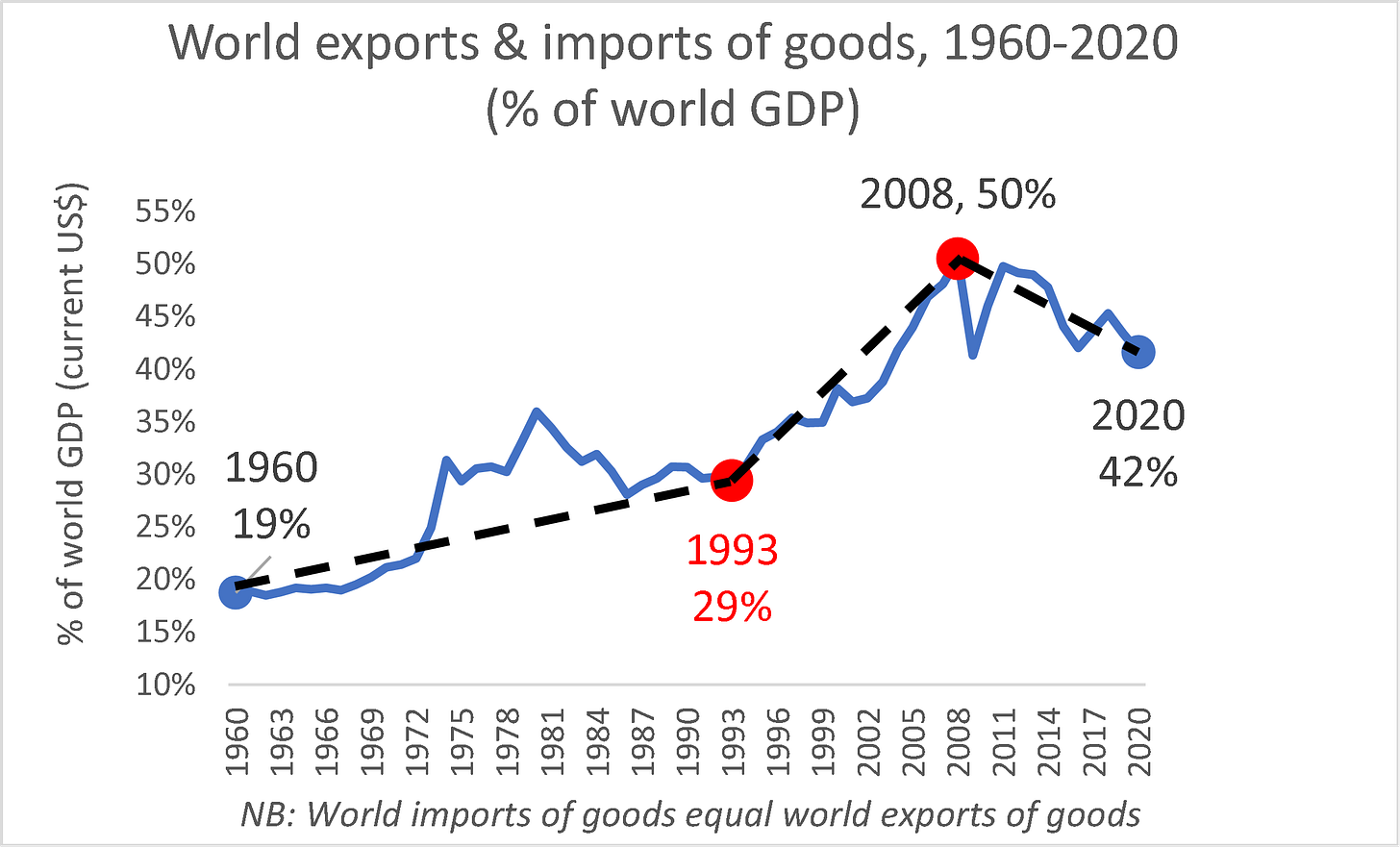
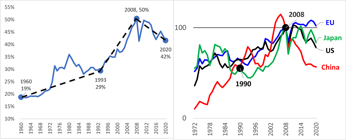
For a lazy analyst, the peak-globalisation story can be told in one chart (Figure 1). The narrative asserts that:
1) Trade in goods expanded relative to world output at a gentle pace from 1960 to 1993; this was driven by reductions in transport costs as well as policy barriers like tariffs.
2) Around 1990, trade in goods started growing much faster than incomes.
This rapid globalisation was driven by the Information and Communications Technology (ICT) revolution that launched globalisation’s ‘offshoring expansion’ phase (Grossman and Rossi-Hansberg 2006, 2008). The offshoring entailed factories crossing borders (not just goods crossing borders). As parts and components were now crossing borders multiple times (e.g. first as parts and then as parts built into components or final goods), the trade ratio naturally rose.
Moreover, the offshoring-expansion was accompanied by a massive shift of manufacturing knowhow to a handful of emerging markets that sparked unprecedentedly rapid industrialisation and growth (Baldwin 2016 chapter 3). The resulting equalisation of the sizes of national economies mechanically raised the trade share as per the usual gravity equation logic (Helpman and Krugman 1985, chapter 8).
3) In 2008, the Global Crisis and attendant trade shock – what I dubbed “The Great Trade Collapse” (Baldwin 2009) – mortally wounded globalisation; the trade ratio has been declining ever since.
Figure 1: The Globalisation-has-peaked lazy narrative
Source: Author’s calculations based on WTO (trade data) and WDI database (GDP data, current USDs).
I apply the label ‘lazy’ to this three-part narrative since it embeds myths of omission and commission. To start with, while it seems plain as day in Figure 1, the 2008 peak is false. It is a coincidental confluence of disparate peaks.
I apply the label ‘lazy’ to this three-part narrative since it embeds myths of omission and commission. To start with, while it is plain as day from Figure 2 that the 2008 peak is false. It is a coincidental confluence of disparate peaks. I turn now to a number of corrections of the lazy narrative.
Correction no.1: 2008 is a false peak
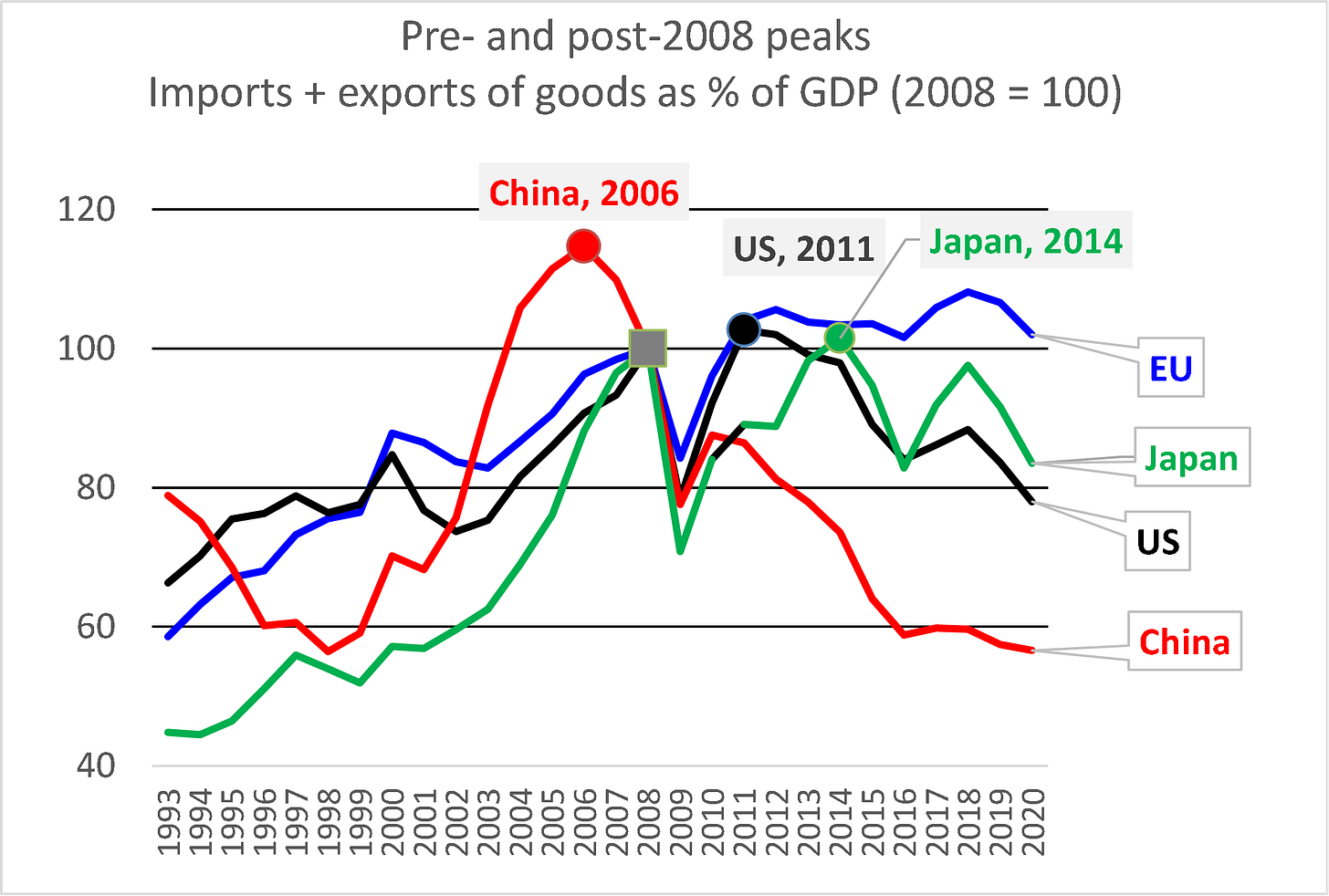
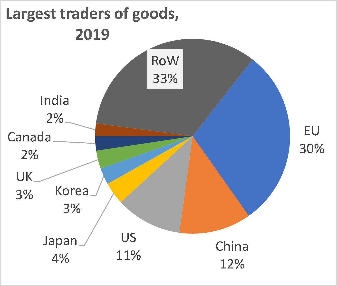
Figure 2 (left panel) shows that the largest traders in the world either peaked before or after 2008. The chart shows indices of the national ratios rebased to 2008 = 100 to emphasise the trends. The world’s second largest trader of goods (China) peaked before 2008 (in 2006). The third and fourth largest goods traders (the US and Japan) peaked after 2008 (in 2011 and 2014 respectively). The world’s largest trader, the EU, has not clearly peaked, although it has clearly stagnated. To get a perspective on how important the four traders are in world trade, the right panel shows the shares of world trade in goods by nation in 2019, i.e. last year before the Covid-19 distortions.
The point here is that forcing these dissimilar peaks into one peak conveys a false impression. It is a myth to think that we need to find a single set of reasons why world trade in goods peaked as a share of income in 2008.
Figure 2: The false peak is made up of various pre- and post-2008 peaks of the largest traders
Source: Author’s calculations based on WTO (trade data) and WDI database (GDP data, current USDs). EU trade includes intra-EU trade since intra-EU trade is part of world trade.
Correction no.2: The peaking behaviour of the US, China, and Japan is not universal (France and Germany are peakers but Italy, Spain and Netherlands are not)
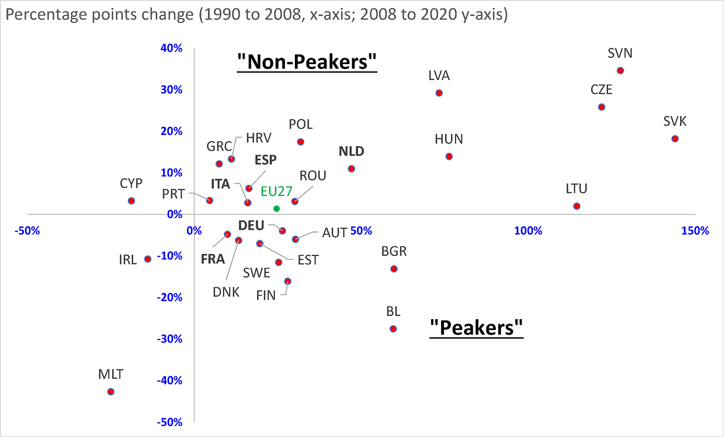
The flatline of the EU’s trade-to-GDP ratio in Figure 3 hides an important heterogeneity among EU members. Some EU members, for example, are relatively poor and fast growing while other are rich and slow growing. Some are very large while others are smaller in terms of population and economic size than, for instance, the city of Marseille. Not surprisingly, the EU member display very different peaking behaviours.
Figure 3 plots the rise in the goods trade ratio for each member from 1990 to 2008 on the horizontal axis, and the rise (or fall) from 2008 to 2020 on the vertical axis. Nations in the southeast quadrant are peakers as their ratios rose up to 2008 but have since fallen. Those in the northeast section are non-peakers having seen their ratio rise in both periods. The biggest EU economy by far is Germany and it finds itself in the peaker category along with France. Three other large economies, Italy, the Netherlands, and Spain are in the non-peakers’ basket. The dot representing the aggregate EU’s behaviour is basically on the line between the peakers and non-peakers categories.
Figure 3: Goods trade ratios: peakers and non-peakers in the EU
Source: Author’s calculations based on WTO (trade data) and WDI database (GDP data, current USDs). EU trade includes intra-EU trade since intra-EU trade is part of world trade.
Correction no.3: China is normalising its trade share (with Chinese characteristics)
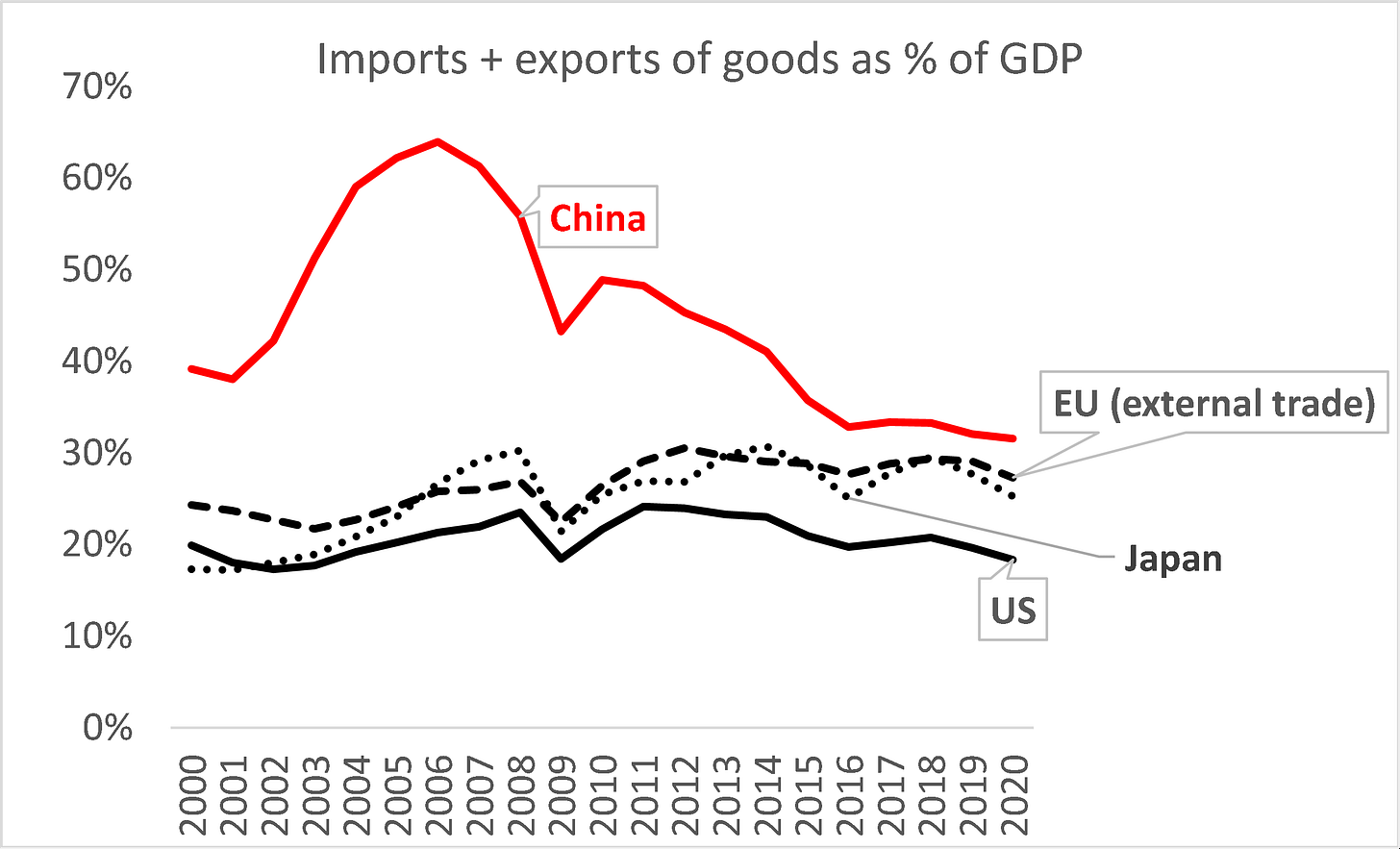
Although not strictly part of the peak globalisation story, the time pattern of China’s trade-to-GDP ratio is often held up as a sign that China is doing something highly unusual. The inference is that the Chinese state must be intervening forcefully. Of course, the Chinese government is intervening forcefully – that’s the heart-and-soul of state-led capitalism – but it is a myth to use the time path of its macro trade ratio as evidence of this.
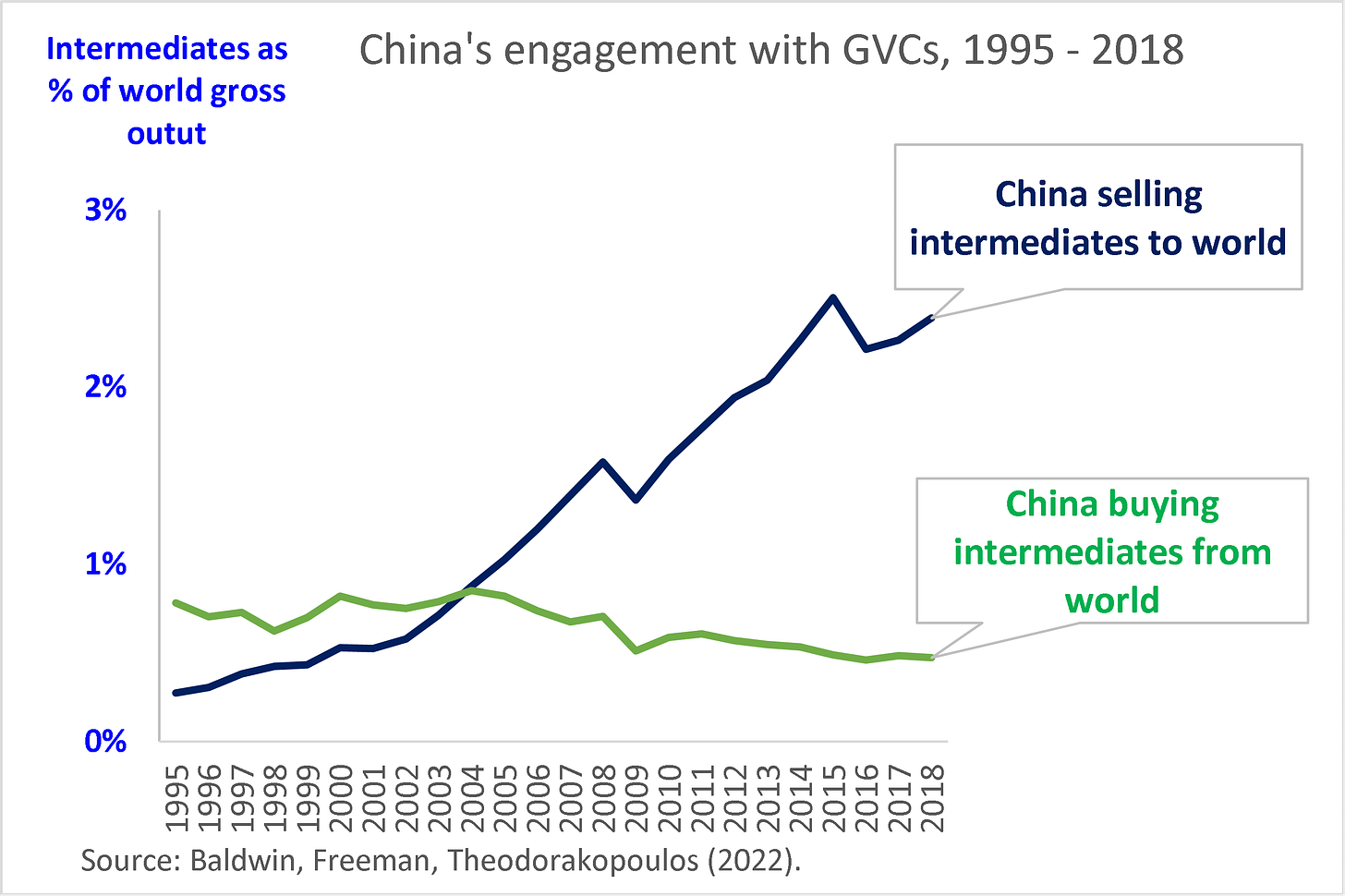
Figure 4 shows that China’s openness ratio is not acting abnormally. It is converging to the ratios that are common to all mega-economies like the US, Japan, and the EU (focusing only on extra-EU trade). What is unusual is the asymmetric way China’s globalisation is evolving in terms of selling to and buying from global supply chains.
Figure 5 presents indicators of China’s engagement with global supply chains that are based on the OECD TiVA database.[3] The data, which are available only from 1995 to 2018, show that China is rapidly becoming the ‘OPEC of industrial inputs’ for the whole world. Chinese-made inputs account for about 3% of the entire global gross output. By contrast, China is scaling back its purchases of intermediate goods from the rest of the world, relying more on its own industrial base to provide the inputs.
Figure 4: China is converging to openness of a normal mega-economy
Source: Author’s calculations based on WTO (trade data) and WDI database (GDP data, current USDs). EU trade excludes intra-EU trade since here we take the EU as a mega-economy.
Figure 5: China’s very asymmetric engagement with global value chains (GVCs)
Sources: Calculations undertaken by Rebecca Freeman and Angelos Theodorakopoulos using concepts developed in Baldwin, Freeman and Theodorakopoulos (2022).
Concluding remarks
The ‘globalisation has peaked’ narrative – a narrative that almost jumps straight out of Figure 1 – is overly simplistic. Of the four largest traders in the world, one peaked well before 2008, while two peaked well after. The world’s largest trader – the EU – did not peak even if its trade-to-GDP ratio has not risen for a decade.
In short, the ‘globalisation has peaked’ storyline is lazy but there is a highly energetic reality behind it. The globalisation of markets for goods is no longer rising as it had been between the 1990s and the mid-2000s.
Part 2 of this series looks into some of the reasons the goods trade ratio has declined.
The peak globalisation myth: Part 2 – why the goods trade ratio declined
Richard Baldwin, 1 Sep 2022 on VoxEU.org
Part 1 of this series of VoxEU columns presented evidence that the standard ‘peak globalisation’ chart was misleading in several ways. The peak in 2008 is false in the sense that it hides important heterogeneity. As Figure 1 shows, the trade ratio for large trading nations either peaked before 2008 (China) or after (US and Japan), and the world’s largest trader, the EU, has not peaked so much as stagnated (and there is important heterogeneity among the large EU members; France peaked in 2001, Germany in 2012, and Italy, the Netherlands, and Spain have not yet peaked).
Figure 1 World trade in goods as a % of world GDP (left), and ratios indexed to 2008 = 100 (right)
Source: Author’s calculations based on WTO (trade data) and WDI database (GDP data, current USDs).
The falsity of the peak matters, since attempts to associate the changes in globalisation with the traumatic Global Financial Crisis of 2008 – or the Great Trade Collapse that followed – are almost surely misguided. While the 2008 peak is false, there is no doubt that trade in goods as a share of GDP is no longer rising as it had been since the end of World War II. Understanding why globalisation changed requires more subtle reasoning.
This second instalment in this series of VoxEU columns digs deeper into why trade in goods is declining in so many of the largest trading nations. The main focus is to bring some evidence to the most common explanations for why the ratio has declined since 2008. We start by decomposing the global peak into price and quantity terms.
Relative prices matter since world trade and world GDP have very different compositions
The numerator of the goods trade ratio in Figure 1 (left panel) has a composition that is very different from its denominator. World trade in goods is about three-quarters manufactures, with the rest roughly equally split between agricultural goods and mining products. World GDP is made up of something like two-thirds services and only one-third goods. Given this mismatch, relative price changes can have a big impact on the ratio, and, as history would have it, relative price changes really did move the ratio.
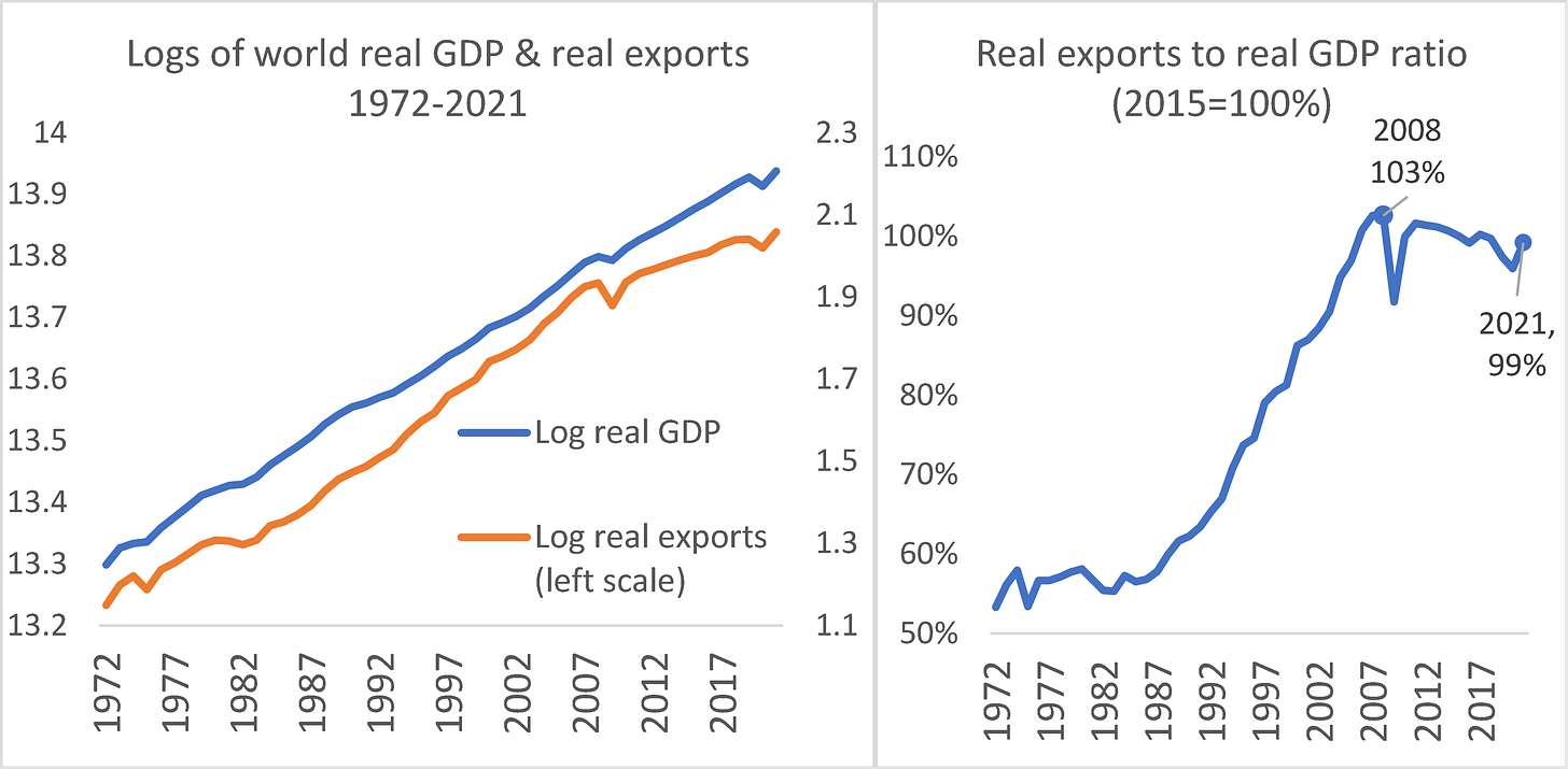
Figure 2 illustrates the point. The left panel plots the logs of real world GDP and the logs of real world exports. Recalling that the slope of a series in logs equals the growth rate of the series, we see that the growth of real exports outstripped real GDP from the early 1980s to 2008 but that the reverse was true after 2008 – which is why we observe the 2008 peak in the ratio. The key point here is that the ratio of goods trade to GDP fell because GDP was rising faster, not – as one might have thought from the public discussion – because trade in goods was falling.
The right panel shows that the global peak still appears in real terms, but it is more moderate than the peak we get using the ratio of nominal series (Figure 1, left panel). Using nominal series, the ratio fell 8 percentage points between 2008 and 2020; using constant price series, the drop is only 4 percentage points.
Figure 2 World real exports and GDP evolution, 1972-2021 in logs, and ratio of volumes
Note: Left panel: Log of real GDP (constant 2015 USD), and log of world export volume fixed-base index (2015 = 100). Right panel: Volume of world exports (2015=100) from WTO over GDP, constant 2015 USD index (2015=100) from WDI.
Source: Author’s calculations based on WTO (trade data) and WDI database (GDP data).
Two other salient points in the charts are noteworthy. First, the fluctuations during the 1970s shown in the ratio in Figure 1 are due to relative price changes, not trade-volume changes. Second, the sharp acceleration in the rise of the ratio that appears around 2001 in Figure 1 is due to price changes, not changes in real activity. As the left panel of Figure 2 demonstrates, the growth of world trade in goods was rather constant in real terms between 1982 and 2008.
The point that relative prices have had a macro effect on our inferences from the ratio brings us to the next set of important points – the commodity composition of the peak.
Commodity composition of the 2008 peak
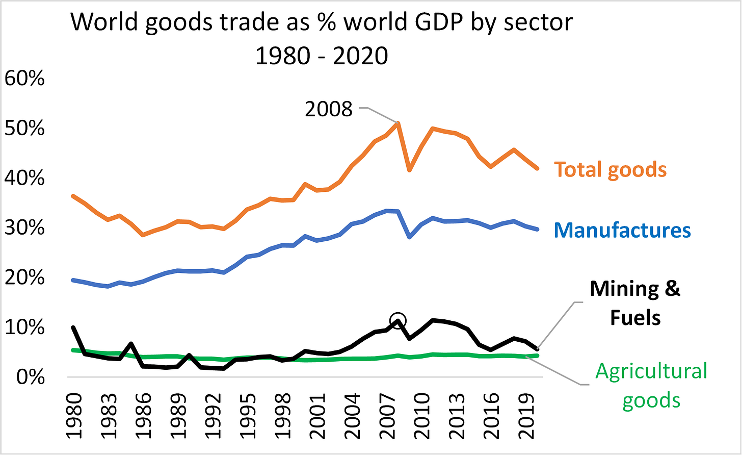
Figure 3 displays the world goods trade flows – broken down into agriculture, mining and fuels, and manufactures – all flows divided by total world GDP (all figures in nominal terms to be comparable to Figure 1). When constructed in this way, the series in the figure all have the same denominator (world GDP) so they can be added vertically.
The data show that about 60% of the fall in the goods-trade share of GDP is due to a drop in the value of trade in mining goods and fuels as a share of world GDP. The rest is due to a reduction in the trade in manufactures. More precisely, the GDP share for all traded goods (total goods in the chart) fell from about 50% to 42% between 2008 and 2020. The share of mining and fuels trade in world GDP dropped from 11% in 2008 to 6% in 2020. The share of manufacturing trade in world GDP dropped from 33% in 2008 to 30% in 2020.
Figure 3 World goods trade to world GDP ratio, by sector, 1980 – 2020
About 60% of the drop in the trade ratio was due to mining and fuels, the rest by manufactures.
Source: Author’s calculations based on WTO (trade data) and WDI database (GDP data).
Trade values and volumes have not dropped (except mining goods & fuels)
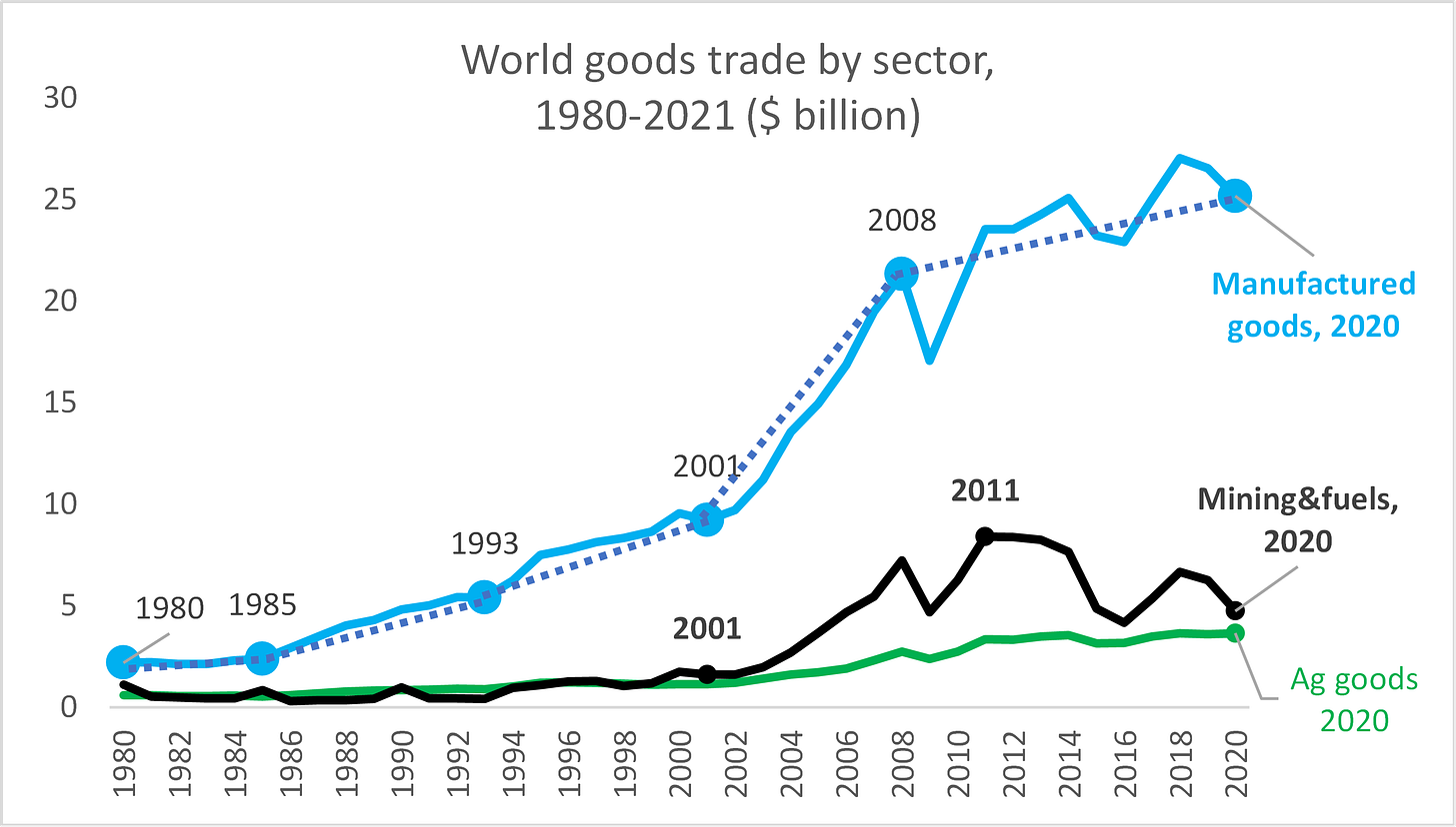
To get an idea of the movement in trade independently of world GDP, Figure 4 shows the flows in billions of USDs without normalisation by world GDP. The pattern is, naturally, similar to that of Figure 3, but we see that trade in mining goods and fuels actually fell in nominal terms, while the two other series grew post-2008.
Figure 4 Value of world goods trade, by sector, 1980 – 2020 (USD billion)
Source: Author’s calculations based on WTO (trade data).
The important role of the 1998-2014 commodity supercycle
The fact that more than half the decline in the trade ratio is due to goods related to mining and fuels is a warning sign for grand theories about deglobalisation. Sweeping analyses claiming that the 2008 peak is all about the end of multilateralism, or the end of the neoliberal regime, will struggle to account for the plain fact that 60% of the fall was due to a phenomenon known as the ‘commodity supercycle’ (Cuddington and Jarrett 2008).
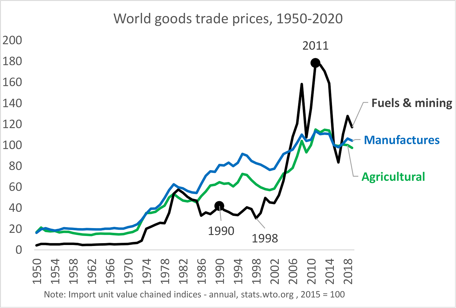
Figure 5 displays the prices of traded goods for the world from 1950 to 2020. The so-called commodity supercycle is plain to see. From the late 1990s to the mid-2010s, the price of fuels and mining goods first soared and then crashed. Since the ratio in the global peak in Figure 1 has the value of trade in the numerator, relative prices matter. Notably, the importance of fuels and mining in total goods trade rose substantially (in value terms) during the start-to-peak phase of the supercycle, from 8% of goods trade to 24%. (The annex digs deeper into some facts about the supercycle.) Also important is the fact that prices for manufactures have fallen since 2008, so the slower growth in world trades in manufactures is, in part, due to lower prices rather than a slowdown in real activity. The same goes for agricultural goods.
Figure 5 World prices for goods trade by sector: the 1998-2014 commodity supercycle
Note: In 1989, at the start of the supercycle, mining & fuels accounted for 8% of goods trade, while agriculture and manufactures accounted for 15% and 77%. In 2011, at the summit of the supercycle, the corresponding shares were 24%, 9%, and 67%.
Source: Author’s calculations based on WTO (trade data).
As the offshoring expansion slowed, and commodity supplies rose in response to booming demand and prices, global prices of commodities came off the boil.
Concluding remarks
The public discussion on globalisation tends to obsess over manufactured goods. Indeed, much of the analysis implicitly assumes that most of the drop is due to reduced trade in manufacturing goods. The usual culprits are the war on trade started by President Trump in 2018 (especially the US-China cycles of retaliation), Brexit, the rise of populism, and the decline of support for open trade in G7 nations. Some analysts spin it out to demonstrate a broad turning away from multilateralism and the open liberal system (Foroohar 2022).
This VoxEU column presents evidence that the decline in the goods-trade-to-GDP ratio is in line with much more mundane explanations that have much less world-shaking implications for global commerce. About 60% of the decline is due to a drop in the ratio for fuels and mining goods, which dovetails nicely with the massive drop in the price of commodities from about 2010. The rest is due to a fall in the ratio of manufactures to GDP.
The next column in the series will dig into the decline of the manufacturing trade ratio. This will marshal evidence to support the notion that global supply chains are unwinding, as pointed out by Antras (2021).
Annex: Zooming in on the commodity supercycle
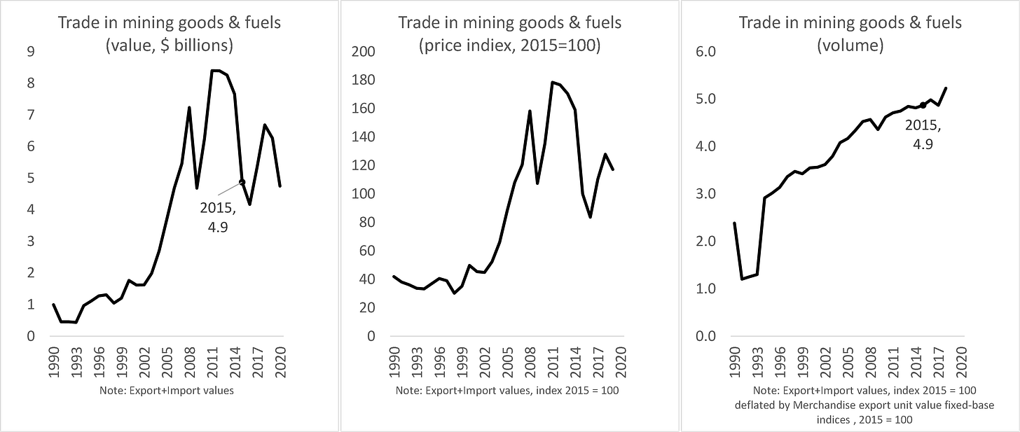
Figure A1 zooms in on the evolution of mining-goods and fuels price and volume. The leftmost panel shows the path of world exports and imports of goods in current US dollar terms. The middle panel shows the price path (taken from Figure 5), and the rightmost panel shows the value series deflated by the price series. The importance of price developments is most clear from the rightmost panel. This indicates that in volume terms, trade in mining goods and fuels has continued to grow steadily after 2008. But the leftmost panel tells us that the price movements more than offset the volume movements. In short, the supercycle is all about prices, not real trade volumes.
Figure A1 Breaking down the commodity super cycle into prices and volumes
Source: Author’s calculations based on WTO (trade data).
While the facts are clear, the connection between the price developments and the globalisation process is not. One could argue that the commodity supercycle was part of globalisation’s unwinding. The question is: Was the supercycle a random occurrence, or was it linked to the offshoring-expansion phase? In my 2016 book, I argue that the two are linked. The argument is straightforward.
How the supercycle was driven by globalisation’s second unbundling
ICT-fuelled offshoring transformed globalisation’s impact on the world because G7 manufacturing firms started combining their high-tech knowhow with workers in low-wage nations as part of the offshoring (Baldwin 2016). This high-tech/low-wage combination turned the world of manufacturing competitiveness on its head. A handful of emerging markets (especially China) were competing in manufactures using high tech and low wages. Industrial workers in G7 nations, working with high tech and high wages had trouble keeping up. Industrial workers in developing nations that did not get the offshored manufacturing stages and the tech that came with them were competing with low tech and low wages. They too had trouble keeping up with high-tech/low-wage workers in China and a handful of other nations.
This rapid industrialisation in a handful of emerging economies sparked historically unprecedented income growth, and since these rapid industrialisers included India and China, the rising demand for commodities triggered the 1998-2014 commodity supercycle.
The peak globalisation myth: Part 3 – how global supply chains are unwinding
Richard Baldwin, 2 Sep 2022 on VoxEU.oerg
This series of VoxEU columns seeks to remove some of the myths surrounding the notion of ‘deglobalisation’. The first column presented the prima facie case for the ‘peak globalisation’ narrative, pointing out that the crisp peaking of goods trade as a share of GDP in 2008 hid important aspects of the global reality. The second column looked at the sectoral composition of the global peak. It showed that about 60% of the decline in the ratio post-2008 was due to a drop in trade in mining goods and fuels (Figure 1), which was entirely due to a drop in the price of these commodities. Commodity prices have soared recently, but the analysis stops at 2021.
This third instalment in the series takes a closer look at the part of the drop that is foremost in most analysts’ minds, namely the ratio of manufactures trade-to-GDP (Figure 1).[4]
Figure 1 World goods trade to world GDP ratio, by sector
About 60% of the drop in the trade ratio was due to mining and fuels, the rest to manufactures.
Source: Author’s calculations based on WTO (trade data) and WDI database (GDP data, current USDs).
Note: the series all have the same denominator so they can be added vertically.
Are global supply chains unwinding? Is reshoring a reality?
In the public debate on deglobalisation, a standard explanation for the drop in the ratio of trade in manufactures-to-GDP is that global value chains (GVCs) have unwound (Antras 2021). Note that the terminology on this has not stabilised. The unwinding is also known as ‘reshoring’, ‘shortening of global supply chains’, ‘friend-shoring’, or ‘near-shoring’. Moreover, GVCs are also known by the more descriptive label ‘global supply chains’, although authors differ on the exact definition of these terms.[i]
If such an unwinding did occur in a globally significant way, it would provide a natural explanation for the drop in the trade-to-GDP ratio. The point is that it would lead to a reduction in the multiple border-crossings of parts and components that helped drive up the ratio during the offshoring-expansion phase (Baldwin 2016, chapter 3).
Before interrogating the trade data on the reshoring hypothesis, we look at a couple of non-trade indicators that suggest the massive reorganisation of world manufacturing production has shifted from one equilibrium (where almost all manufacturing was done in G7 nations) to another (where a handful of emerging markets, especially China, have become major manufacturing powers).
Production-based indicators of the end of the offshoring-expansion phase
Reshoring manufacturing can be thought of as consisting of two parts. The first is the end of the offshoring expansion that dialled up trade in manufactured goods in the early part of globalisation’s ‘second unbundling’. The second part is the reduced complexity of supply chains globally, both within and among nations. We start with evidence that the offshoring-expansion phase has come to a close.
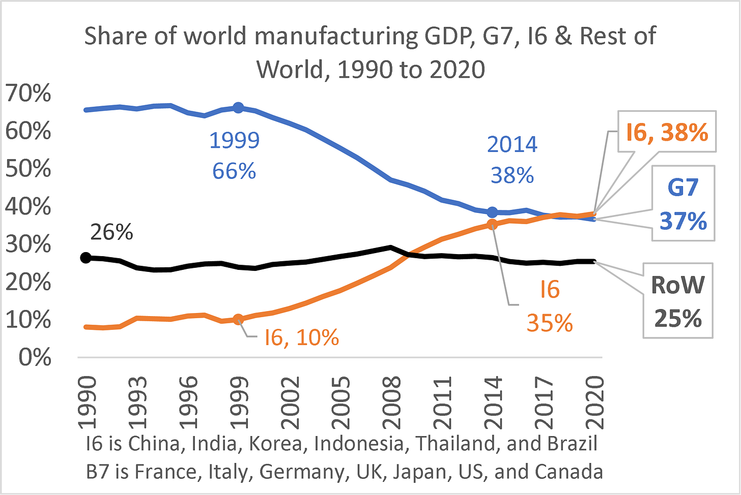
Figure 2 shows how the G7 share of global manufacturing evolved between 1990 and 2020. What we see is that the G7 share started at a very stable, very high level. These seven economies – the four big European nations (France, Germany, Italy, and the UK), Japan, and the two North American nations (Canada and the US) – accounted for two-thirds of world manufacturing up to the end of the 1990s. The G7 share declined fairly rapidly from the late 1990s right up to the mid-2010s (66% to 38% of the world total). Since then, the G7 share seems to have plateaued, or at least the drop has slowed substantially.
The figure also shows six rapidly industrialising emerging economies – what might be called the I6. These were chosen since they are the only economies that gained more than one-half of one percentage point in their global share of manufacturing between 1990 and 2020. They are, with the percentage points gained in parentheses: China (+16.2), India (+1.5), Korea (+1.5), Indonesia (+1.0), Thailand (+0.5), and Brazil (+0.5). The two most noteworthy points are, first, that the I6’s gain is essentially the mirror of the G7’s loss and, second, that the I6’s gain slowed significantly around the mid-2010s.
The behaviour of the G7 and I6 shares is consistent with the idea that the low-hanging fruit, so to speak, has been picked when it comes to offshoring manufacturing to emerging markets. The easy and obvious opportunities for combining ‘high technology’ with low-wage labour in emerging-market factories have been exploited.
Observe how the shift in manufacturing shares is highly concentrated in the I6. All the other nations in the world saw almost no change in their collective share of world manufacturing.
Figure 2 High-income countries’ share of world manufacturing GDP, 1997-2020, and ratio of world value added to gross output (%), 1995-2018
The offshoring-expansion phase has ended.
Source: Author’s calculations based on UNIDO data, Manufacturing Value Added, current USD. https://stat.unido.org/database/National%20Accounts%20Database.
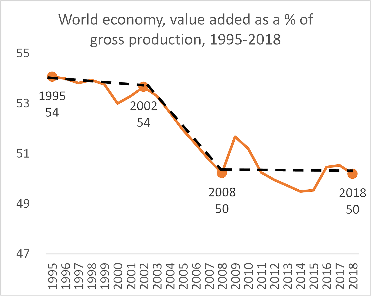
A very different type of evidence for the end of the offshore-expansion phase is displayed in Figure 3. Understanding the evidence, however, requires a bit of background. The figure shows the ratio of value added to gross production for the entire world economy (all sectors). Gross production is the value added of all firms in the world (i.e. GDP) plus the value of all the inputs of goods and services that all firms buy from all other firms (this equals the value of global intermediate inputs). When production becomes more fragmented along national or international lines, the ratio of value added to gross output falls. In a sense, the ratio of value creation to sales falls as intermediate inputs are sold among firms rather than produced within firms. The ratio is thus an inverse measure of the degree of production fragmentation. Or to put it differently, the ratio falls when supply chains become longer or more complex.
Figure 3 The ratio of world value added to gross output (%), 1995-2018
The expansion of the supply chain has plateaued worldwide.
Source: Author’s calculations based on OECD TiVA database, which is only available for 1995 to 2018. https://www.oecd.org/sti/ind/measuring-trade-in-value-added.htm
As argued, globalisation’s ICT-fuelled second unbundling led to a spatial unbundling of the stages of production and thus a lengthening of supply chains, both domestically and internationally. This shows up very clearly in the figure. There is a gentle decline (increase in supply-chain complexity) from 1995 to 2002, followed by a sharper fall from 2002 to 2008 and a plateauing after that.
The magnitude of the fall is not very impressive, from 54% to 50%, but these figures include the entire world economy. Since about two-thirds of world value added is generated by the service sector, and the global supply chain revolution was mostly concentrated in manufacturing, this modest impact is to be expected.
Focus on manufacturing
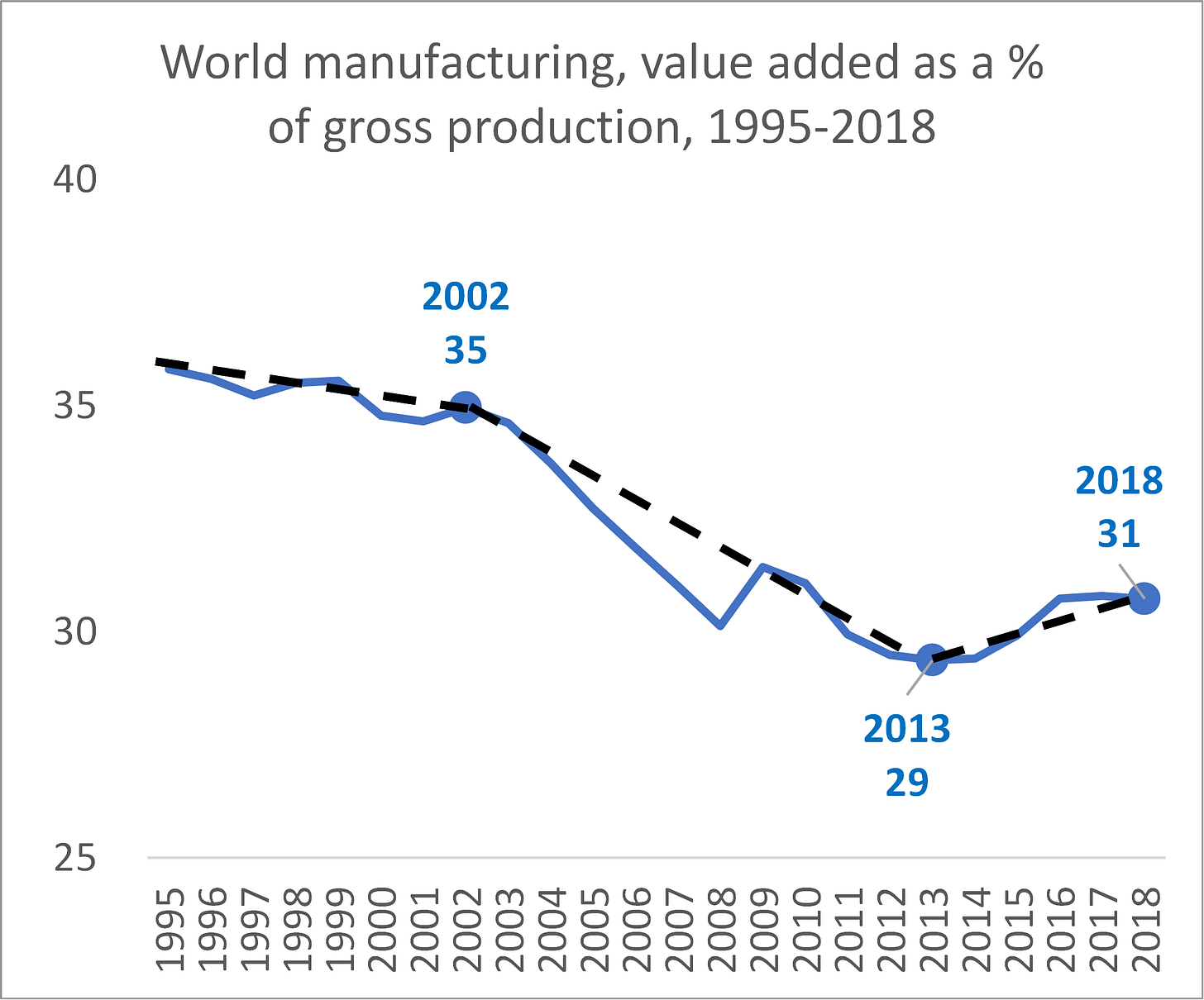
When we focus only on the world’s manufacturing activity (Figure 4), the drop is a bit bigger, with the ratio falling from 35 in 2002 to 29 in 2013. Notice that the level of the ratio is much lower for manufacturing than it is for the whole economy because manufacturing firms generally use far more purchased inputs than firms in the service sector. Another noteworthy fact is the behaviour of the ratio after 2013.
Figure 4 World manufacturing ratio of value added to gross production, 1995-2018
(An inverse measure of supply chain complexity.)
Source: Author’s calculations based on the TiVA database.
The fact that the ratio rises suggests that supply chains are becoming less complex. Or, to put it differently, that supply chains are ‘unwinding’. The ratio rose from 29% to 31% between 2013 and 2018, so we know that the average manufacturing firm is doing more of its value creation inside the firm. That is one definition of unwinding the complexity of supply chains. The shift is not huge, and we only have five years of data, but this can be taken as evidence that the famous unwinding has indeed been taking place.
The timing of the unwinding is important for rejecting deglobalisation assertions in the public discourse. According to Figure 3 data, it started in 2013, five years before Trump started his war on trade and three years before Brexit, but five years after the Global Financial Crisis.
The measures examined hitherto focused on production, not trade. The next measures focus on trade in intermediate goods (a very direct measure of international supply chains).
Trade-based measures of reshoring
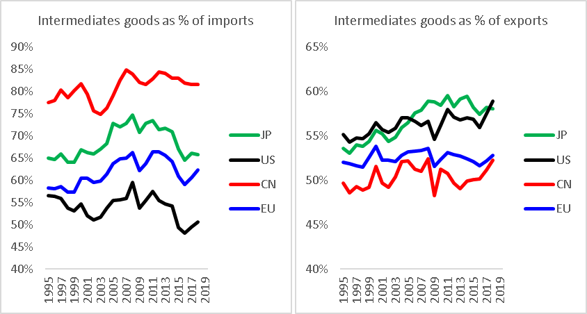
One direct measure of the intensity of global supply chains is the share of imports that is made up of intermediate goods. If a country is intensively sourcing parts and components from foreign sources, then the share of intermediates in its imports should be high.
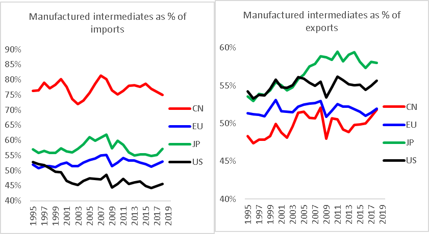
Figure 5 shows the facts for the four big trading economies. In the left panel, which presents the facts on the import side, we see that there has been a clear peaking of the intermediates ratio. All four traders saw significant increases in their share of intermediates from 1995 to the mid-2000s (during the offshoring-expansion phase). For China, the change since the mid-2000s has been more of a plateauing than a decline, but for the others, the decline is clear. The upshot is that the biggest traders and the biggest manufacturers are doing less international sourcing of intermediates. That is one way of defining the unwinding of global supply chains.
Figure 5 Share of imported goods made up of intermediate goods, all sectors, 1995-2018
Source: Author’s calculations based on indicators in the TiVA database. Specifically, the denominators are EXGR and IMGR while the numerators are EXGR_INT and IMGR_INT.
On the export side (right panel), the outcome is more mixed. Japan experienced an increase in its export share made up of intermediates in the offshore-expansion phase and stagnation or slight decline since. The EU pattern looks rather stable throughout, although it should be noted that the TiVA data do not include trade within the EU. Since most of the offshoring happened within ‘Factory Europe’, the figures in the chart need to be interpreted with care. China’s pattern involves a rise and then decline, but a rise in recent years. Overall, the change from the mid-2000s peak and 2018 is very small. The US, by contrast, has seen a steady rise in the intermediates share of its exports throughout the period.
The lesson from the charts is that the biggest manufacturing economies are not disengaging from global supply chains on the selling side (Figure 5, right panel), even if they are on the sourcing side (left panel).
The usual GVC discussion focuses on a few manufacturing sectors, like autos, electrical and mechanical equipment, pharmaceuticals, and chemicals (World Bank 2020). To acknowledge this, Figure 6 shows the same shares as in the figure above but focuses only on manufactures.
The patterns here – especially for imports – present a clear picture of reshoring. On the export side, the patterns for the EU and China are quite like the Figure 6 patterns, since the exports of the two economies are dominated by manufactured goods.
Figure 6 Share of imported manufactured goods made up of intermediate goods, 1995-2018
Source: Author’s calculations based on indicators in the TiVA database. Specifically, the denominators are EXGR and IMGR while the numerators are EXGR_INT and IMGR_INT for manufacturing sectors.
Concluding remarks
This column was a deeper dive into the decline in the ratio of trade in manufactures as a share of world GDP. The decline resulted from two things. First, the offshoring-expansion phase has come to a close. The rising part of the trade-to-GDP ratio peaks was greatly enhanced by the unbundling and offshoring of some manufacturing stages from high-income nations to a handful of emerging economies. This process has attained a new equilibrium, where the share of manufacturing in high-income nations has stabilised. Second, the overall complexity of supply chains, both domestically and internationally, has fallen.
In the last column in the series, I complete the presentation of the facts. This will show that trade in services has not peaked.
References
Antras, P (2021), “De-globalisation: Global value chains in the post-COVID-19 age“, paper written for the ECB Forum on Central Banking, 2020.
Baldwin, R (2016), The Great Convergence: Information technology and the new globalisation, Harvard University Press (Chapter 3).
Baldwin, Richard (2022). “Globotics and macroeconomics: Globalisation and automation of the service sector”, paper presented at 2022 ECB Forum on Central Banking in Sintra.
World Bank (2020), Trading for development in the age of global value chains: World Development Report 2020.
The peak globalisation myth: Part 4 – services trade did not peak
Richard Baldwin, 3 Sep 2022 on VoxEU.oerg
The first three instalments in this series of VoxEU columns focused on trade in goods. The takeaway was that trade in goods as a share of GDP peaked around 2018, but the peak was not synchronised and some of the largest trading economies have not peaked. Sixty per cent of the decline was due to a reduction in the value of commodities trade, all of which was due to a decline in prices from the mid-2010s to 2020 (the recent spike in commodity prices started after that). The rest was due to unwinding, or reshoring of international supply chains (Antras 2021).
The global peak of trade in goods as a share of global GDP is a wake-up call. The alarm clock is telling us that globalisation has changed. The previous columns in this series focused on the part of the change that stems from changes in trade in goods. This was a natural starting point since trade in goods makes up almost 80% of all world trade.
In this column, I argue that the future of globalisation is not goods but services – in particular intermediate services. I will present economic logic and facts that support the idea that international commerce will shift to being dominated by trade that I called telemigration in my 2019 book, The Globotics Upheaval (Baldwin 2019).
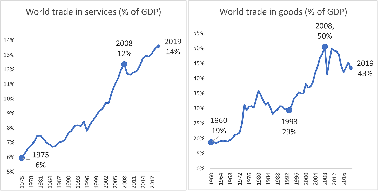
The key fact presented in this column is that trade in services has not peaked in the way goods trade has (Figure 1). In sharp contrast to trade in goods, trade in services continues to boom and shows no tendency to slow. Note that the scales are very different in the two panels.
Figure 1 Services trade vs goods trade (% of GDP)
Goods trade peaked; services trade did not.
Source: Author’s calculations based on WTO (trade data) and WDI database (GDP data, current USDs).
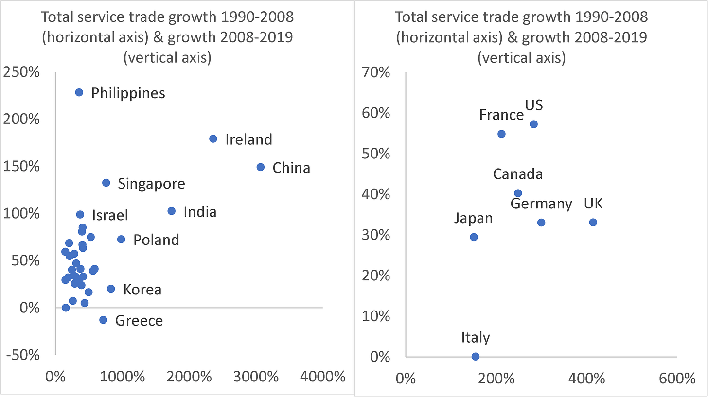
The individual economy trends show that non-peak behaviour is widespread when it comes to services trade. Figure 2 (left panel) shows scatter plots of the percentage-point changes in services trade for large traders (economies whose service trade amounts to at least half a per cent of world services trade). All of the economies show growth both before and after 2008, except Greece, which recorded a slight decline after 2008.
Figure 2 Total service trade before and after 2008; largest traders (left) and G7 (right)
Note: The vertical axis plots cumulative growth after 2008 (2008 to 2019); the horizontal axis plots cumulative growth before 2008 (1990-2008). Covid-19 seriously distorted services trade from 2020, so the chart stops at 2019. The large traders are China, Ireland, India, Poland, Korea, Singapore, Greece, Brazil, Malaysia, Thailand, Denmark, Spain, Ukraine, Indonesia, the Netherlands (NL), Türkiye, Switzerland, Finland, Portugal, Israel, Philippines, Hong Kong – China, Australia, Germany, Sweden, US, Saudi Arabia, Norway, Canada, France, Chinese Taipei, Austria, Italy, Japan, Mexico. Together they account for over 85% of world trade.
Source: Author’s calculations based on WTO (trade data).
The pre-2008 growth is spectacular for many of the nations. While they started from low bases, China, Ireland, and India experienced miraculous growth rates from 1990 to 2008 – all over 1000%. Those with over 500% growth include Poland, Korea, Singapore, Greece, Brazil, Malaysia, and Thailand. China’s growth rate was the highest at 3070%.
Growth did not stop in the post-2008 period. In the 12 years from 2008 to 2020, several of the big traders enjoyed service-export growth over 100%. The Philippines was the league leader with its 228% rise but was a slow starter (only 86% growth before 2008). India’s trade in services rose 1740% from 1990 to 2008, and 102% after 2018. For Ireland – which counts as a major service exporter since tech companies have moved their intellectual property there in pursuit of low taxes (and payments for intellectual property count as trade in services in today’s statistics) – the corresponding figures are 2362% and 179%.
The right panel spotlights the G7 nations, and again we see that all were non-peakers, although Italy’s service trade stagnated in the second period. The growth numbers, however, are more moderate than the emerging economies in the left panel.
The pandemic and services trade – sectoral decomposition
The pandemic hit goods trade in 2020, but this was more than reversed in 2021. Services trade was hit much harder since it includes international travel, international tourism, and transportation, which were directly impacted by the lockdowns and mobility restrictions. Looking at the sectoral composition of services trade requires a bit of background.
The data on trade in services are in poor shape. They are not really fit to track the impact of trade in services on the global economy. One is, nevertheless, forced to work with the data that exist rather than the data one might wish for. In official statistics, the high-level categorisation divides total services into three baskets. The first two are well understood and easily interpreted – travel (which includes tourism), and transportation. The third is ‘other commercial services’ (OCS). This is harder to explain than it should be for such an important element of international commerce.
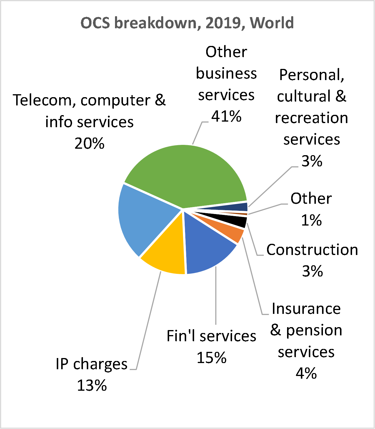
OCS is a grab-bag of things ranging from people paying for their Spotify subscriptions and US companies hiring call-centre workers in Manila to payments to the giant Indian outsourcing companies and Gazprom paying Ukraine for transit rights through its pipelines. The pie chart in the right panel of Figure 3 shows the next-level disaggregation of OCS. Some of the services are recognisable, but fully 40% is thrown into the ‘other business service’ category. All Indian service outsourcing and all the call centres are piled into ‘telecom, computer & info services’ along with payments for international telecommunications. Bunching utility-like services (telecom) together with offshored software development is typical of the non-analytic organising principle that seemed to have been used in collecting the statistics.
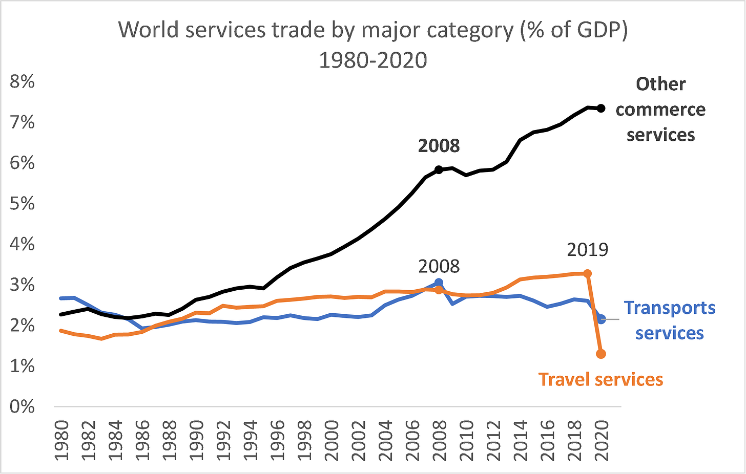
Figure 3 Services trade by major category (% of GDP)
Travel and transport dropped with Covid-19.
Source: Author’s calculations based on WTO (trade data) and WDI database (GDP data, current USDs). EU trade excludes intra-EU trade since here we take the EU as a mega-economy.
Figure 3 shows trends of the three high-level categories. The first two categories were especially hard hit by Covid-19 and the accompanying lockdowns and travel restrictions. According to the latest data (2020), travel has still not recovered (for example, China is still not easily accessible to travellers and the government discourages Chinese from leaving the territory). Transport services also suffered and have not recovered.
Note that the travel category, like trade in goods, did peak in 2008. This is to be expected as international transport services are closely tied to trade in goods. Travel and OCS did not peak, and indeed OCS is still booming.
Other commercial services (OCS) trade has grown much faster than goods trade
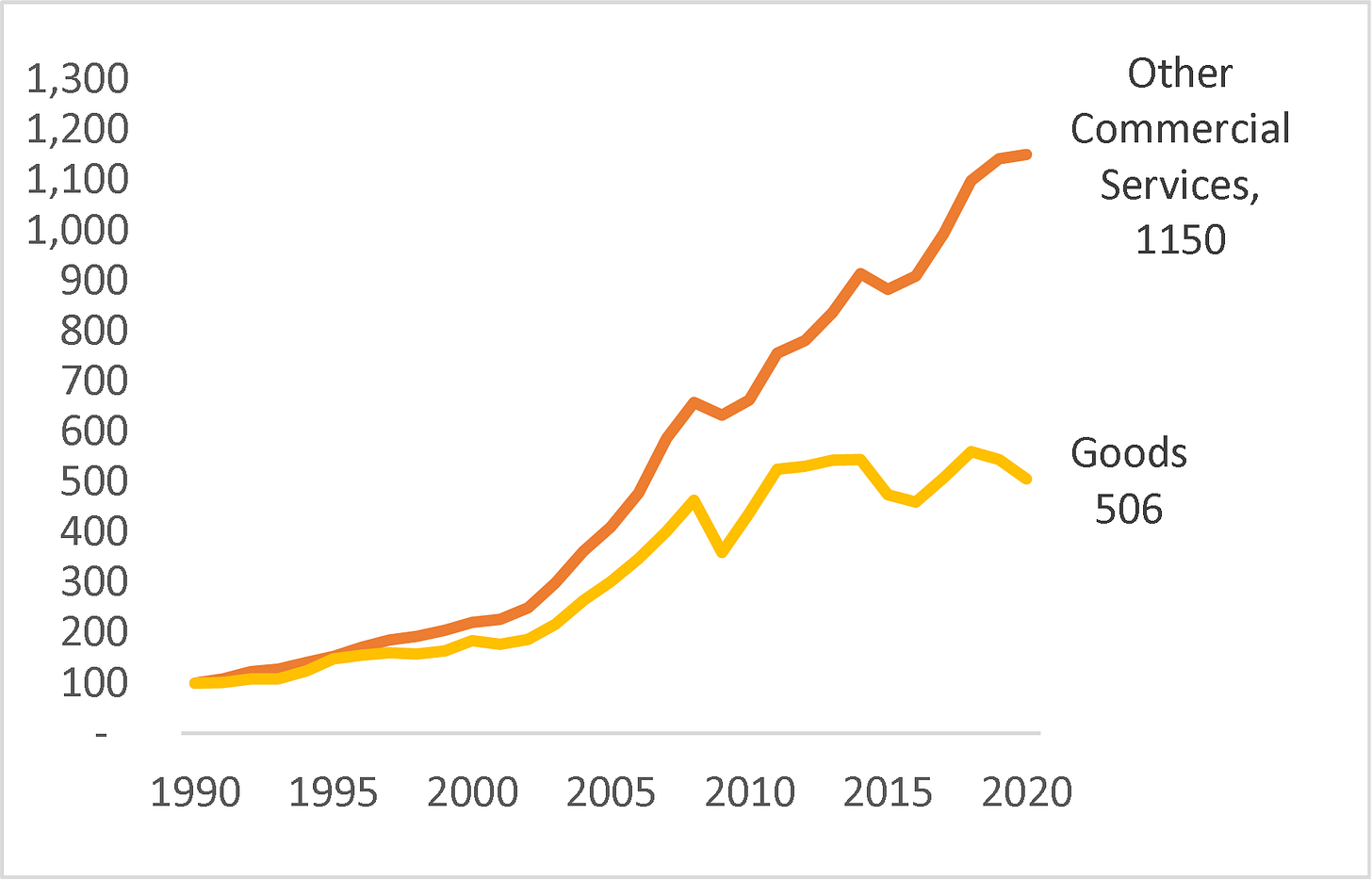
It is useful to focus on OCS trade since it is dominated by activities that – like trade in goods – are done in one economy and sold to another. Figure 4 shows that worldwide OCS flows have grown faster than trade in goods for decades (left panel), but the divergent paths became more pronounced after the 2008-09 Great Trade Collapse (Baldwin 2006). While trade in goods recovered in 2010, it has stagnated overall. By contrast, OCS has continued to grow rapidly. Between 1990 and 2020, goods expanded 5 times while OCS multiplied by 11 times.
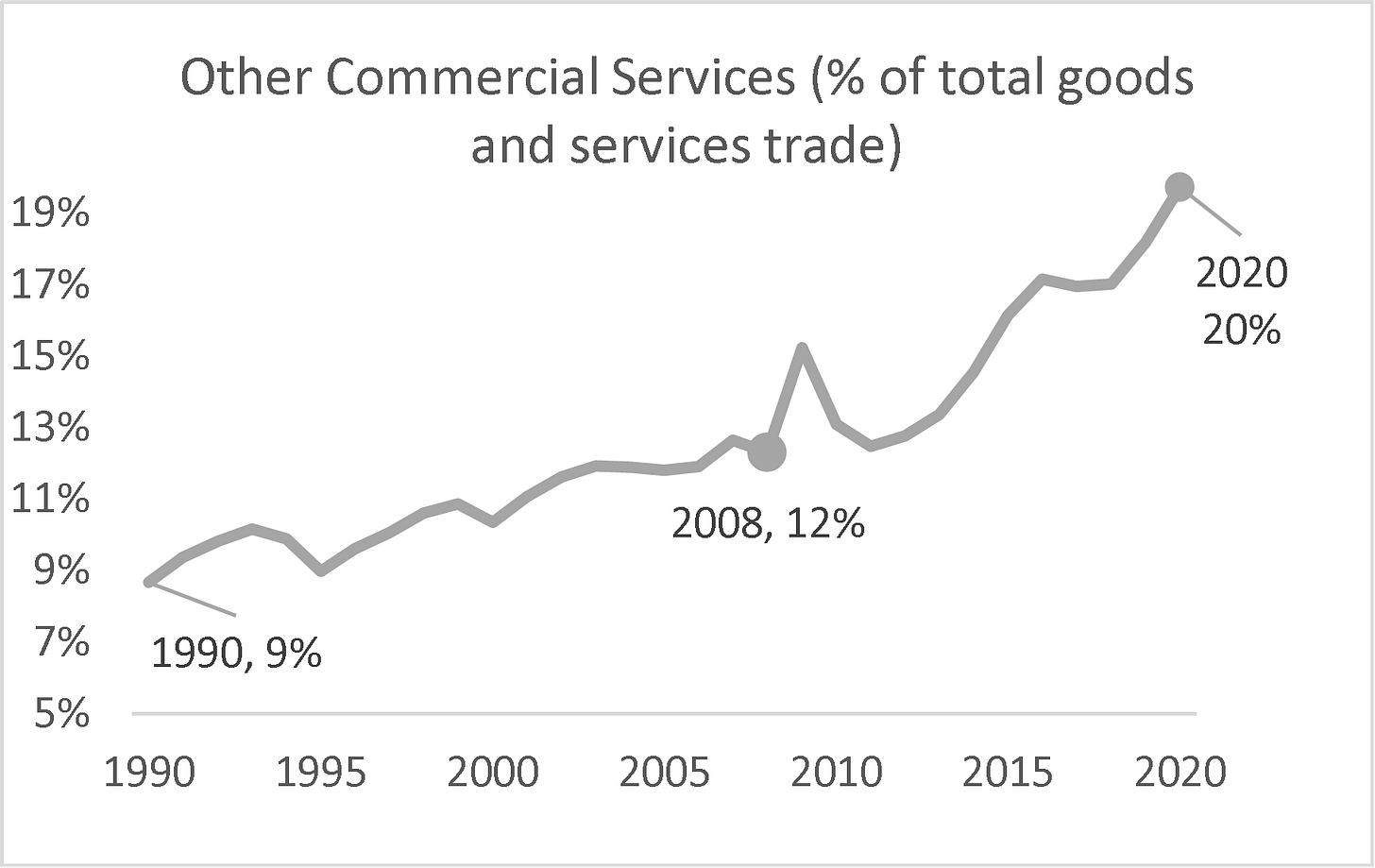
Figure 4 Trade in ‘other commercial services’ (OCS) has grown twice as fast as goods trade since 1990, and now constitutes 20% of all international commerce
Note: The series here are not as a share of GDP; they are values indexed to 1990 = 100 to stress the trends.
Source: Author’s calculations based on WTO (trade data).
The right panel shows how this has shifted the importance of services in international commerce. In 1990, OCS accounted for only 9% of all trade in goods and services, but by 2020, that figure had tripled, and its rise shows no sign of abating.
The future of globalisation is trade in intermediate services
I turn now to the argument I first made in Baldwin (2022) that the future of trade is services, especially intermediate services. The argument boils down to four facts and a deduction.
First, barriers to trade in most services are now orders of magnitude higher than the barriers to trade in goods (Benz and Jaax 2022), but many of today’s service barriers are technological rather than fiscal or regulatory.
Services are hard to tax at the border, so most barriers arise from domestic regulation (OECD 2022). Much of this regulation, however, concerns ‘final’ services, not ‘intermediate’ services. For example, while there are strict rules for selling accounting services in the US, there are few rules concerning the qualifications of the service workers that do the paperwork behind the provision of such accounting services. A US accountant can employ pretty much anybody to tally up a client’s travel expenses and collate them with expense receipts. The quality control burden falls on the sellers of the final service, not government regulators.
Examples of occupations that provide intermediate as opposed to final services include bookkeepers, forensic accountants, CV screeners, administrative assistants, online client help staff, graphic designers, copyeditors, personal assistants, travel agents, IT security consultants, IT help staff, software engineers, lawyers who can check contracts, financial analysts who can write reports, and the list goes on and on.
The key point is that imported services are hard to tax when they cross the border. Protection of the domestic service sector relies on regulation. Most of the regulation, however, only applies to final services. Such regulation restricts who and how a service can be sold from a service provider to a final service customer. Generally, these don’t apply to intermediate services. As a result, the main barriers to trade in intermediate services are technical – for example, the difficulties of coordinating work teams that include faraway workers.
The second fact is that digitech is rapidly lowering the technological barriers to trade in intermediate services.
These first two facts mean that service-trade barriers are falling radically faster than goods-trade barriers and are likely to continue doing so for the foreseeable future.
The third fact is that export capacity in emerging markets is not as great a limiting factor in services as it is in goods since every nation has a workforce that is already producing intermediate-service tasks.
All emerging market economies have lots of workers trained to do intermediate services domestically in all the occupations listed above. There is no need to develop whole new sectors, build factories, or develop farms or mines.
The fourth fact is that demand is not a limiting factor. Businesses in G7 nations spend a great deal on intermediate services – some of this could be provided by foreign-based workers.
A rough idea can be had by looking at all the tasks that were done remotely during the pandemic. Services are three times more important as intermediate inputs into domestic production than manufactures.[5] The key role of trade in intermediate goods is widely recognised in the whole global value chain debate (Johnson 2014). What is little known is that intermediate services are vastly more important in leading economies. Table 1 shows, for the French economy, that at the level of the whole economy (bottom row), intermediate service inputs account for 30% of the total gross output, while manufactured intermediates account for only 11%. Note that ‘gross output’ is GDP plus the use of all intermediates consumed in the production of the final value added.
Table 1 Intermediate services and manufacturing in the French economy, 2018
As share of row-sector’s gross output
Source: Author elaboration on Source: Author’s manipulation of calculations produced by Rebecca Freeman and Angelos Theodorakopoulos using the OECD’s inter-country input-output database. See Baldwin et al. (2022).
The deduction is simplicity itself.
Barriers are radically higher and falling radically faster for services versus goods, and, unlike farm and factory goods, there is no capacity constraint when it comes to intermediate services. This suggests to me that the future of trade lies in services – in particular, intermediate services.
Concluding remarks
Trade in goods has stagnated for a decade and a half. Trade in services has not. Goods trade is still larger, but services now account for almost a quarter of export earnings globally. It also accounts for many export jobs, especially for women, since producing services is more labour intensive than producing goods.
The divergence between the growth of services versus goods happened because digital technology opened the door to trade in intermediate services, and high-income countries have few or no barriers to this sort of exports. India, for instance, performed its service-export miracle without signing a single trade agreement.
Annex
This annex provides a more extensive look at some of the key empirical points in the main text. We start by looking at the key component of services trade: other commercial services (OCS).
Related work by international organisations
The most recent World Development Report leads to the same conclusion using a purpose-built categorisation of services trade (World Bank 2021). The publication points out that what they call ‘data-driven services’ have increased from about one-quarter to almost half of total service exports. In an important World Bank book, Nayyar et al. (2021) look at how OCS is enabling ‘service-led development’.
The International Labour Organization’s flagship report (ILO 2021), which focuses on international freelancing, points out that
a trend has developed towards outsourcing work, both low-skilled and high-skilled, especially as traditional businesses look to digital labour platforms and digital tools to meet their needs for human resources. These platforms host workers from around the world, enabling businesses to complete their tasks at a faster pace and lower price than if the tasks were performed on site. In many instances, the work is outsourced on these platforms by businesses in the global North and performed by workers in the global South.
OCS scatter plot for large traders and the G7 economies
The main text of this column presented the facts for total services trade, but that includes the peculiar categories of transport and travel services. Here we look at the OCS category alone, since it presents a closer analogy to trade in goods, i.e. where trade means things made in one country and sold in another.
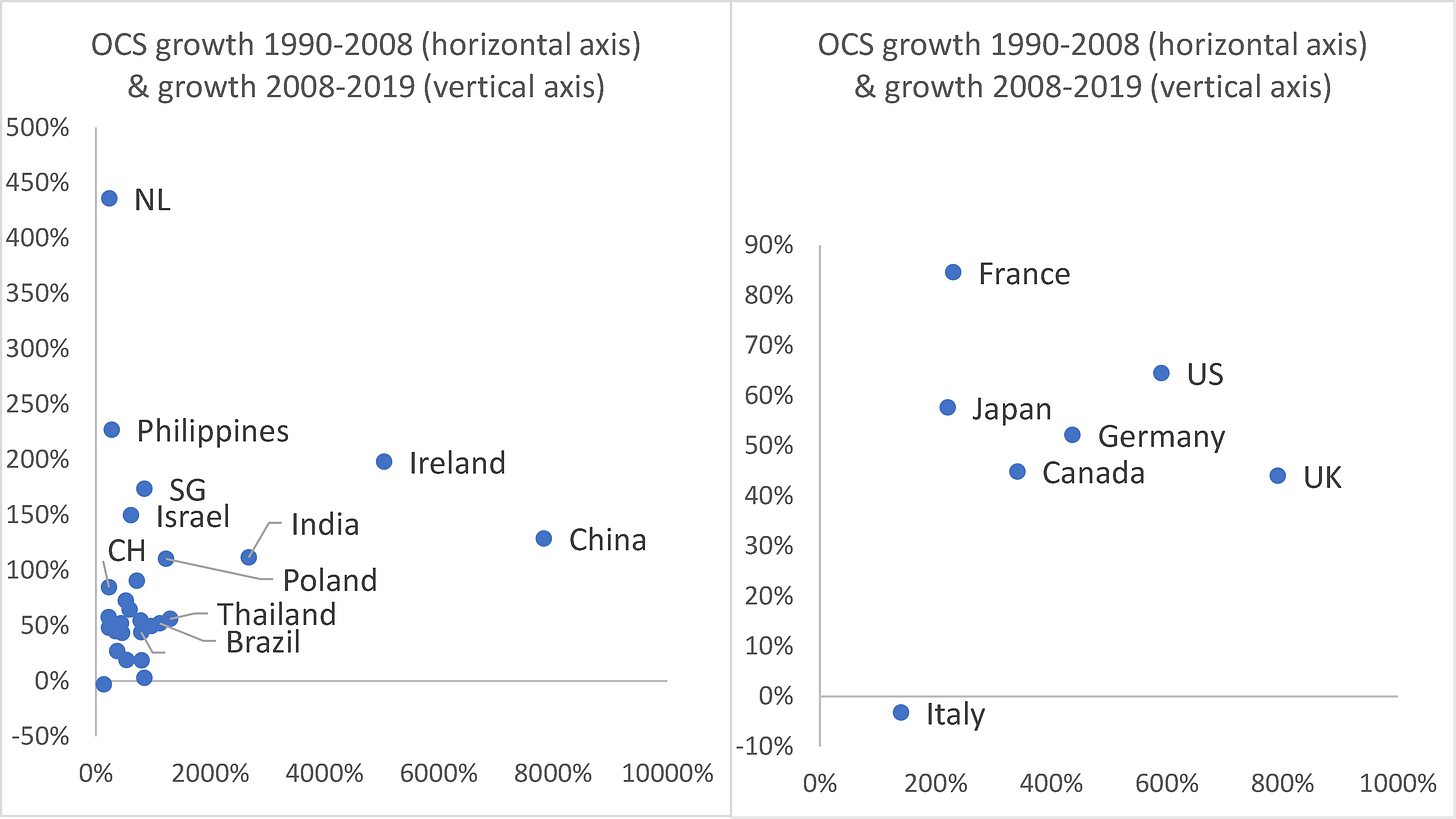
Figure A1 (left panel) confirms the Figure 2 finding that individual economies generally do not display peaking behaviour. Thus, in contrast to goods trade, the non-peaking result is almost universal among large economies. The figure shows the scatter plots of the percentage-point changes in services trade for large traders (economies whose service trade amounts to at least half a per cent of world services trade). All of the economies show growth both before and after 2008, except Italy, which recorded a slight decline after 2008.
Figure A1 Other commercial service (OCS) trade before and after 2008; largest traders (left) and G7 (right)
Note: The vertical axis plots growth after 2008 (2008 to 2019); the horizontal axis plots growth before 2008 (1990-2008). Covid-19 seriously distorted services trade from 2020, so the chart stops at 2019. The large traders are US, Ireland, UK, Germany, Netherlands, China, France, Japan, India, Singapore, Switzerland, Canada, Italy, Korea, Spain, Sweden, Hong Kong, China, Austria, Brazil, Denmark, Israel, Poland, Finland, Taipei, Norway, Australia, Thailand, Philippines, Malaysia. Together they account for over 80% of world trade.
Source: Author’s calculations based on WTO (trade data).
As with overall services trade, the pre-2008 growth (cumulative from 1990 to 2008) is spectacular for many of the nations. China, Ireland, India, Thailand, Poland, and Brazil had rates over 1000%. In the 12 years from 2008 to 2020, several of the big traders enjoyed service export growth over 100%. The Philippines was the league leader with its 227% rise but was a slow starter (only 230% growth before 2008). India’s trade in services rose 2680% from 1990 to 2008, and 110% after 2018. The right panel breaks out the G7 nations for better visibility. All but Italy were non-peakers.
Who are the big players in the trade in services arena?
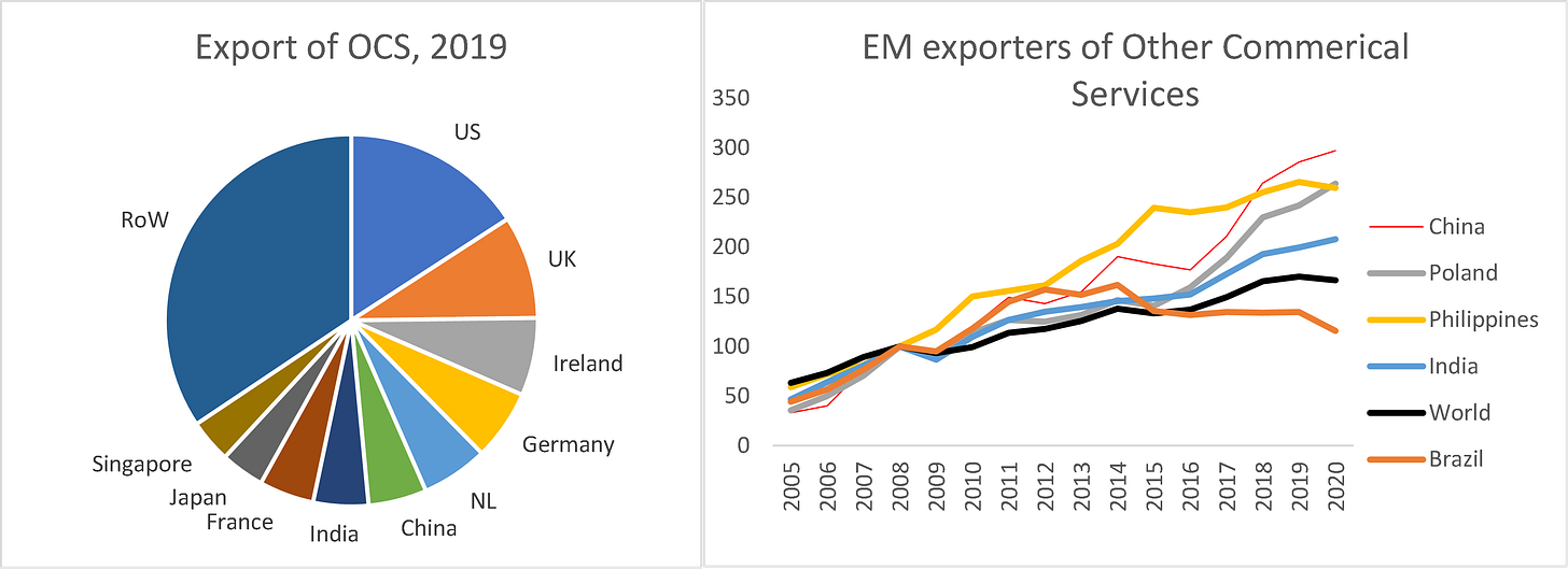
The global shares of the largest OCS exporters are shown in Figure A2 (left panel). The top ten exporting nations account for about two-thirds of all service exports. The US, UK, Ireland, Germany, and the Netherlands alone account for about 40% of world exports. Adding in India and China brings the total to over half. The right panel shows that most of the large emerging economies are seeing faster-than-average growth in their service exports.
While advanced economies still account for the bulk of service exports worldwide, the role of emerging economies is fast gaining pace. The biggest emerging market exporters of services are – in order – China, India (with 5% of the world total each), Korea, Poland, the Philippines, and Brazil. The world export of OCS has risen by 1.7 times since 2005, but the OCS exports from China and India, for instance, have almost tripled.
Figure A2 Largest exporters of OCS and emerging market (EM) trends since 2005
Source: Author’s calculations based on WTO (trade data).
A more disaggregated look at trade in services
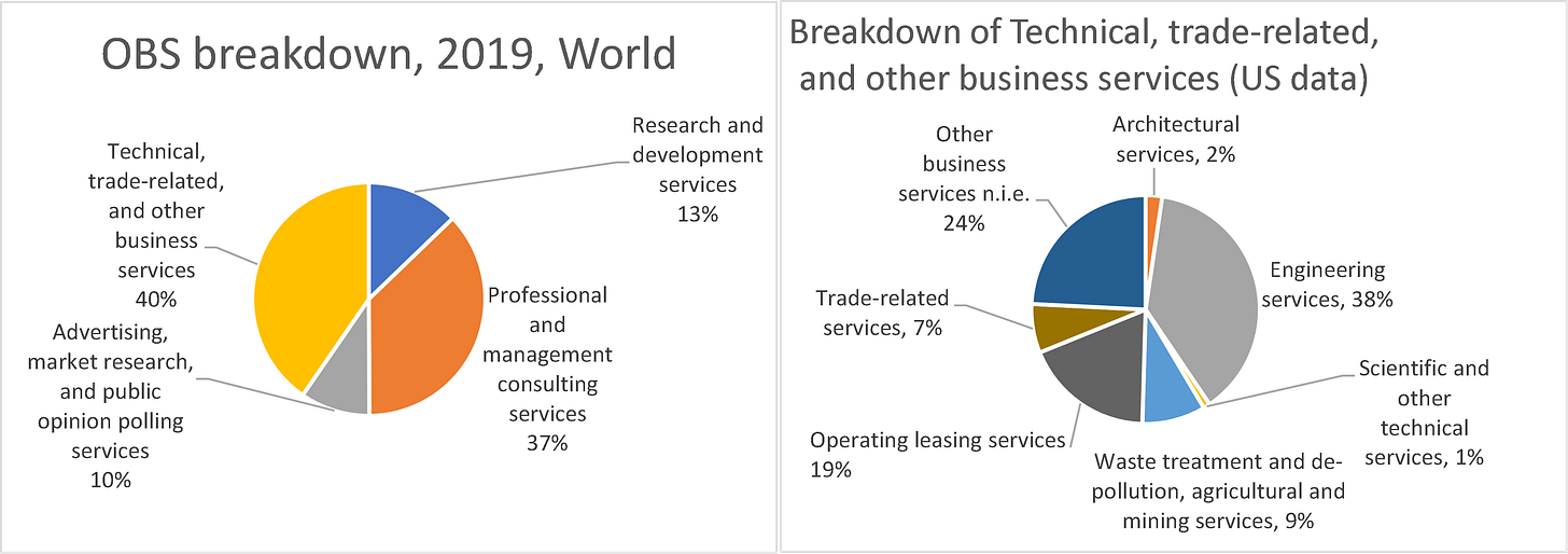
The OCS category consists of a few big items and many small items, as Figure 3 illustrated. The largest sub-category (24%) is ‘other business services’, or OBS (Figure A3). Peeling off another layer of the onion, the left panel of the figure shows the components of OBS. The largest categories are: professional and management consulting services (37% of OBS), and technical, trade-related, and other business services not elsewhere included. Disaggregated figures for the ‘technical, trade-related, and other business services not elsewhere’ category are not available for the whole world, but some nations – like the US – provide more detail.
The right pie chart (which is based on US data since it includes a finer disaggregation than world data) shows the breakdown of ‘technical, trade-related, and other business services not elsewhere’. The big items are engineering services (38%); leasing services (19%); and other business services not included elsewhere (24%).
Figure A3 Breakdown of ‘other business service’, 2019, world (left panel) and US (right panel)
Source: Author’s calculations based on WTO (trade data).
Evidence on trade in intermediate services
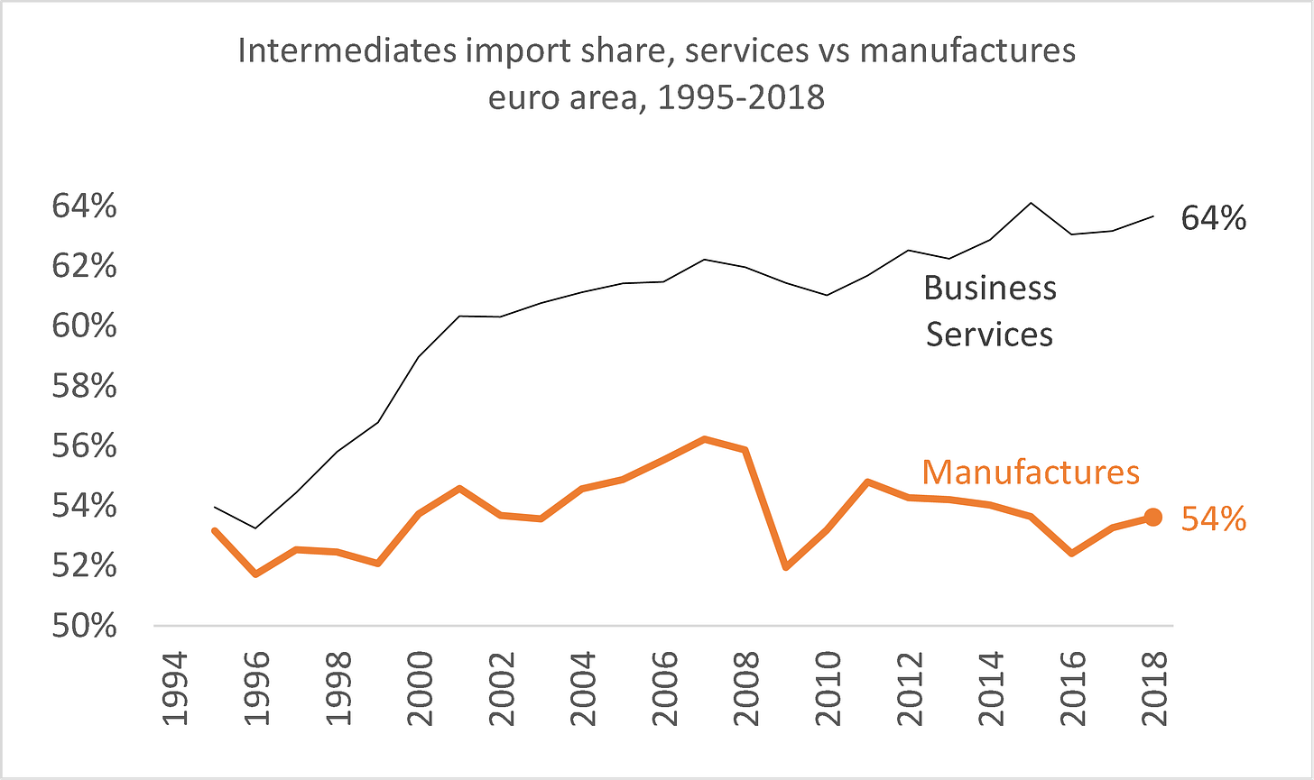
While official services-trade data fail to distinguish between final and intermediate services, the OECD TiVA database does. The left panel of Figure 5 shows that intermediates are more important in imported services than imported manufactures. For manufacturing, intermediates account for about half, and there has been some decline since 2008. For services, the share starts out a bit higher and the gap widens.
Figure A4 Intermediates as share of imported services and manufactures, 1995-2018, euro area 19 and UK (shares of own-sector imports, 1995-2018)
Notes: TiVA data are only available for the 1995-2018 period. Imports in the charts are measured on the usual ‘gross’ basis (not value-added basis). Business services encompass all non-governmental services (the TiVA database categories of services do not line up with standard trade in services categories, like OCS).
Sources: Author’s calculations based on OECD TiVa data, downloaded from stats.oecd.org.
References
Antras, Pol (2021). De-globalisation: Global Value Chains in the Post-COVID-19 Age, paper written for the 2020 ECB Forum on Central Banking.
Baldwin, R (2006), “Globalisation: The great unbundling(s)“, Economic Council of Finland 20(3): 5-47.
Baldwin, R (2009), “The great trade collapse: Causes, consequences, and prospects”, VoxEU eBook, 27 November.
Baldwin, R (2016), The Great Convergence: Information technology and the new globalisation, Harvard University Press (Chapter 3).
Baldwin, R (2016), The Great Convergence: Information technology and the new globalisation, Harvard University Press (Chapter 3).
Baldwin, R (2016), The Great Convergence: Information technology and the New Globalisation, Harvard University Press (Chapter 3).
Baldwin, R (2019), The globotics upheaval: Globalization, robotics, and the future of work, Oxford University Press.
Baldwin, R (2022), “Globotics and macroeconomics: Globalisation and automation of the service sector”, paper presented at ECB Forum on Central Banking in Sintra, June 2022.
Baldwin, R, R Freeman and A Theodorakopoulos (2022), “Horses for courses: Measuring foreign supply chain exposure”, manuscript.
Baldwin, R, R. Freeman and A. Theodorakopoulos (2022). “Horses for Courses: Measuring Foreign Supply Chain Exposure”, manuscript.
Baldwin, Richard (2022). “Globotics and macroeconomics: Globalisation and automation of the service sector”, paper presented at 2022 ECB Forum on Central Banking in Sintra.
Bekkers, E, and C Góes (2022), “The impact of geopolitical conflicts on trade, growth, and innovation: An illustrative simulation study”, VoxEU.org, 29 March.
Bloomberg (2020), “Have we reached peak globalization?”, Bloomberg News, 25 January.
Cuddington, J, and D Jerrett (2008), “Super cycles in real metals prices?”, IMF Staff Papers 55(4).
Foroohar, R (2022), “Davos and the new era of deglobalisation”, Financial Times, 22 May.
Foroohar, Rana (2022). “Davos and the new era of deglobalisation”, FT opinion piece, 22 May. https://www.ft.com/content/1afaa628-41cb-4620-84c9-48b4b6b5b956
Grossman, G and E Rossi-Hansberg (2006), “The rise of offshoring: it is not wine or cloth any more”, in The New Economic Geography: Effects and Policy Implications, Jackson Hole Conference Volume, Federal Reserve of Kansas City, August, pp. 59-102.
Grossman, G and E Rossi-Hansberg (2008), “Trading tasks: a simple model of offshoring”, The American Economic Review 98: 1978-1997.
Haass, R (2020), “Deglobalization and its discontents”, Project Syndicate, 12 May.
Helpman, Elhanan and Paul Krugman (1985). "Market Structure and Foreign Trade: Increasing Returns, Imperfect Competition, and the International Economy," The MIT Press, Cambridge, ISBN 9780262081504.
ILO (2021), World employment and social outlook 2021: The role of digital labour platforms in transforming the world of work, Geneva: International Labour Organisation.
MGI (2019), “Globalization in transition: The future of trade and value chains”, McKinsey & Company, by Susan Lund, James Manyika, Jonathan Woetzel, Jacques Bughin, Mekala Krishnan, Jeongmin Seong, and Mac Muir.
Nayyar, G, M Hallward-Driemeier and E Davies (2021), At your service? The promise of services-led development, Washington DC: World Bank.
Nussbaum, B (2010), “Peak globalization”, Harvard Business Review, 20 December.
OECD (2022), OECD services trade restrictiveness index: Policy trends up to 2022, Paris: OECD, 31 January.
O'Rourke, Kevin (2019). The end of globalisation, interviewed by Tim Phillips, 01 February 2019, https://voxeu.org/vox-talks/end-globalisation
Ruta, Michele (2022). How the war in Ukraine may reshape globalisation, VoxEU.org, 05 May 2022 https://voxeu.org/article/how-war-ukraine-may-reshape-globalisation
Van Bergeijk, Peter (2019). Brexit delay will not postpone deglobalisation, VoxEU.org, 18 March 2019, https://voxeu.org/article/brexit-delay-will-not-postpone-deglobalisation
World Bank (2021), World development report 2021: Data for better lives, Washington DC: World Bank.
[1] This column is based in part on a paper I wrote for the ECB Forum on Central Banking, 2022 (Baldwin 2022).
[2] As Nussman put it, “We, in fact, are living in an era of Peak Globalization as the costs and benefits of globalization begin to diverge according to country, class, and constituency. The international political consensus of the universal economic benefits of globalization that defined much of the 20th and early 21st centuries is breaking down. The centrifugal forces drawing nations toward globalization are giving way to centripetal forces pulling them away from it.”
[3] An inter-country input-output matrix that allows researchers to track global sources and destinations of intermediate inputs by nation and sector.
[4] Parts of this essays are drawn from Baldwin (2022).
[5] The outsized importance of service inputs at the economy-wide level is explained by the fact that the French service sector is twice as large as the primary and secondary sectors combined (68% for services and 32% for manufacturing and primary sectors). This, teamed with the fact that services use a lot of services, results in an enormous demand for intermediate services in the typical high-income country. The annex presents the number for the share of intermediate services in total service imports.
[i] For historical reasons, many authors limit the label ‘global value chains’ to trade that crosses borders at least twice. For example, the foreign inputs into my exports have crossed borders twice: once as a foreign part, and second as part of my export good. ‘Global supply chains’ is often taken as a more general term for any use of foreign inputs into domestic production (whether the production is sold locally or exported).






Well written. Yeah, its a tricky word to use because when people say or hear "globalization" they sometimes just mean international trade. Thats why I sometimes write it as capital "G" Globalization, cosmically ironically, and Globalization deepening or receding may very well not have the effects on trade people might assume at first glance. For example, I strongly suspect that -- cosmically ironically -- if Globalization and its international "trade" deals had never happened at all, there would be far more international trade than there is now....
Wow. That is on the most insightful economic articles I have read. Kudos