
Teaching Trumpian tariffs.
Updating the standard trade diagrams to 2025 realities (13 slides).

By Richard Baldwin, Professor of International Economics, @imd
Factful Friday, 10 October 2025.
Introduction.
Teaching tariffs used to be boring, as many professors of international economics will know. I remember having to to dredge up events that happened well before the birth of most of the students in front of me. That’s changed. Since the Trumpian tariffs went up in April 2025, everyone wants to know about tariffs and their effects. Well, not actually everyone, but last month my dentist did ask me about Switzerland’s 39% tariffs…
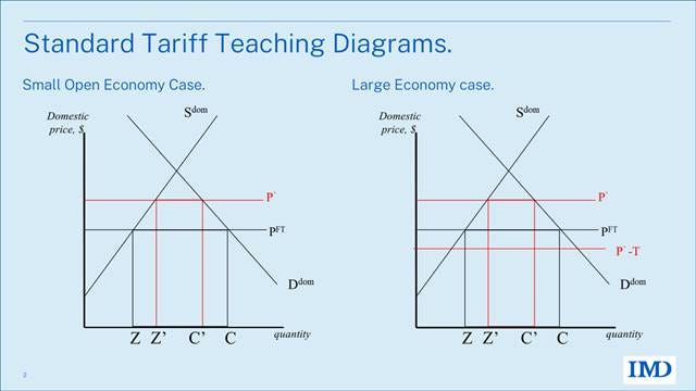
Teaching the effects of tariffs is standard fare in all international economics classes and even in some Econ 101 classes. The diagram used is almost always one of the two in the figure below. The left diagram is for the so-called ‘small country’ case, where it is assumed that foreigners pay none of the tariffs since the world price is fixed. The right is the useful, more realistic, but more complex ‘large country’ case where the incidence of the tariff is split between the home and foreign economies (depending upon elasticities).
These diagrams are an excellent starting point, but they are not enough to teach the essential impact of Trumpian tariffs. And this for three main reasons:
1. Trumpian tariffs are different for different for trade partners – ranging from, say 10% for Saudi Arabia to about 45% for China. The two standard diagrams have only one foreign nation so the implications of changing putting different tariffs on different partners cannot be studied.
Note that before the Trumpian tariffs, the simplifying, one-partner-only assumption wasn’t a problem for a very simple reason. The US charged the MFN tariff on basically all nations (so they could be harmlessly lumped into one ‘Foreign’ nation), except the Free Trade Agreement partners (who got basically zero tariff).
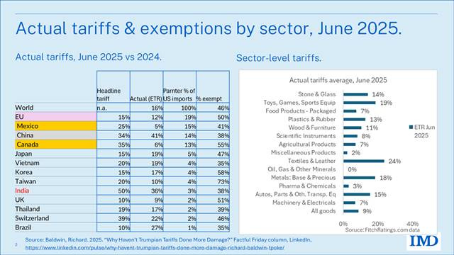
The table below shows the average tariff (technically known as the “effective tariff rate”) varies hugely. The first column shows the announced tariffs, but those aren’t the ones you should pay attention to because many imports are exempted for various reasons. It’s the second column that gives a better idea of the tariffs actually applied to the average export from the listed partner nations. For Mexico, it is just 5% since 41% of Mexican exports are fully exempted. For China, the number is 41%. Almost 38% of US imports from China are exempted, but the tariffs on the remaining imports are very high.
2. Trumpian tariffs are very different for different imported goods – e.g. there is a 0% tariff on energy imports, a 50% on imported steel, and a 25% tariff (with exceptions) on the imported automobiles.
The facts are shown in the right panel.
This really matters since raising the tariff on industrial inputs lowers the effective protection of tariffs on goods that use the steel. This effect has been known for decades – it’s called Effective Rate of Protection theory (Corden 1962) – but professors stopped teaching it in basic courses since all advanced economies had low and fairly uniform tariffs on all types of goods. That’s no longer good enough.
Trumpian tariffs are all over the place by product (cars versus pharmaceuticals, for example), and by partner. Since China is the US’s main supplier of industrial inputs, and it has very high tariffs, and because steel and aluminium are used in many manufactured goods and have sky-high tariff rates, the US is in the situation where the tariffs are much higher on inputs than they are on the final goods that use those inputs. As we shall see, this undermines the US industrial base (in exact opposition to the announced intention), but to see that, we need a new diagram.
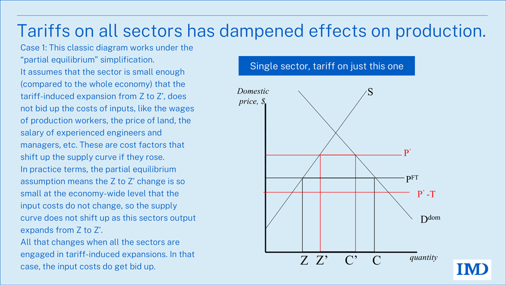
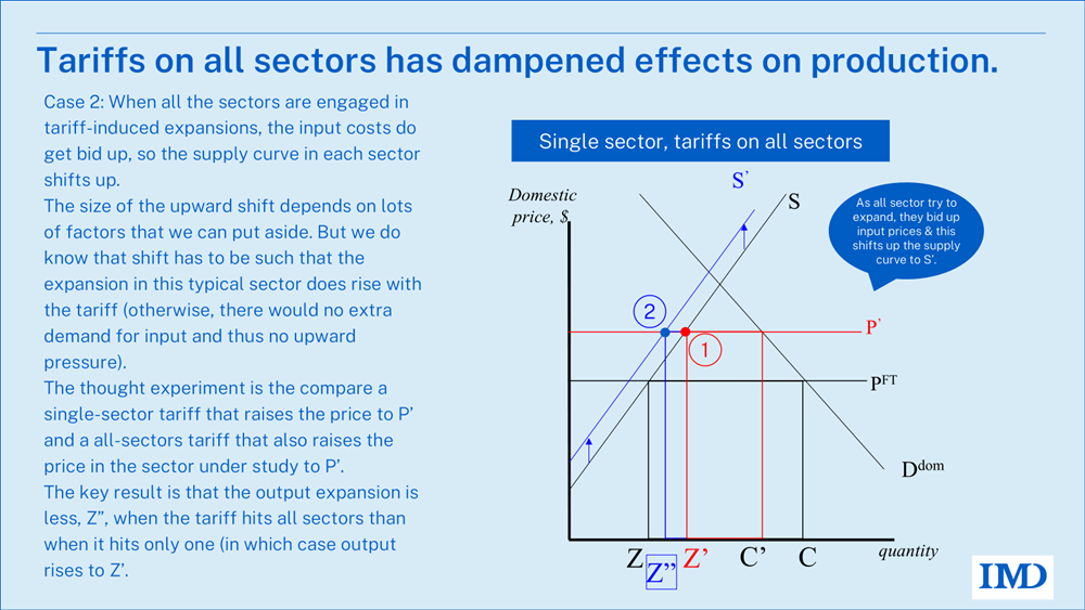
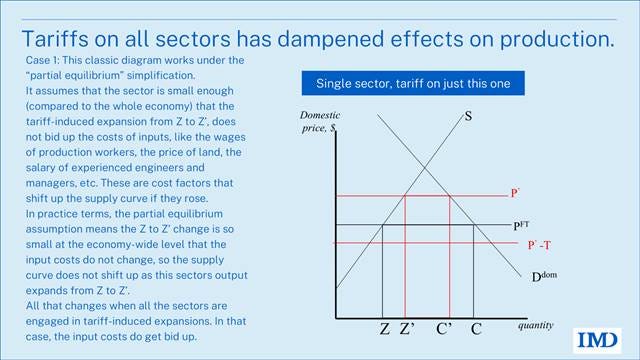
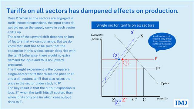
3. Trumpian tariffs are both high and broad – basically there are now tariffs trying to protect every industrial sector at the same time. This means that the partial equilibrium assumption behind the standard diagrams is mis-leading. Those diagrams are useful for thinking about the impact of, say tariffs on washing machines, because the washing machine sector is small enough to ignore general equilibrium effects on factory worker wages, and cost of other resources.
Two new sets of diagrams.
In today’s Factful Friday, I’ll introduce three ‘new’ sets of diagrams that let us speak more analytically about points 1, 2 and 3, namely that tariffs are very different on different partners, very different on industrial inputs than they are on industrial final goods, and high and broad.
When I say “new” I mean I’ve taught them for two or three decades to my students at the Graduate Institute in Geneva. I didn’t make them up from whole cloth, as they say in the Midwest. I synthesised them from the diagrams used by trade economists of my father’s generation. (He got his PhD from Harvard in trade with Gottfied Haberler as his supervisor in 1950). Back then, you see, nations were trying crazy things with tariffs – especially newly independent nations whose trade policy had previously been set by which ever European country had colonised them.
Crazy trade policy, it turns out, is back in fashion. Isn’t there an expression something like: “those who fail to learn the lessons of failed trade policy are bound to repeat the failures”?
The standard tariff diagram: MFN.
The most basic, simplest, and thus most useful analysis of tariffs of all shapes and forms is based on two diagrams: the open-economy supply and demand diagram that helps us track the impact on the tariff-imposing economy, and the import-demand and export-supply diagram that helps us see the global impact of the tariff, in particular on the tariff-laden import price that the tariff-imposing nation pays as well as the ex-tariff price that the exporting nation receives. The two diagrams are linked since each diagram focuses on one part of the worldwide balance of supply and demand.
Having taught these for over 30 years, I find the best way is to take it in three steps. You can find versions of these (and much lengthier expositions) in my textbook with Charles Wyplosz. It’s in the 7th edition now (going into the 8th), but the first edition is: Baldwin and Wyplosz (2004).
Step 1: Where import demand comes from.
Begin with Home’s supply and demand, assuming linearity for artistic convenience.
The left panel shows a nation’s regular supply and demand curves for a particular good; these are the standard microeconomic, partial equilibrium supply and demand curves familiar from introductory microeconomics. The only thing new is that we make the simplifying assumption that imported and domestic goods are perfect substitutes.
If imports were banned, consumption must equal production, and this would force the market price at P*. In other words, at P*, import demand is zero. The right panel marks this zero-import point as point 1. Note the left diagram has price-vs-quantity; the right diagram has price-vs-imports.
What if P were below this cut-off level? If the import price were, for some reason, lower, denoted as P’, the import price would determine the domestic price. Consumers would not pay more than P’, as importing at that price is always an option. Similarly, domestic firms would not set prices below P’, resulting in P’ being the domestic price. At this price level, consumption demand would be C’, while domestic production would total Z’. The difference between consumer demand at P‘ and domestic production represents excess demand, which would be fulfilled by imports. Therefore, imports equal C’ minus Z’ (expressed as M’ = C’ – Z’).
What this tells us is that import demand at P¢ is M¢. This point is marked in the right panel of the diagram as point 3. Performing the same exercise for P² yields point 2, and doing the same for every possible import price yields the import demand curve, MDH.
In short, the lower is the domestic price, the more Home will import.
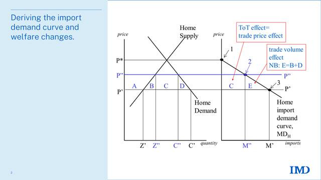
Welfare analysis is simple with this import demand curve. Consider a rise in the import price (i.e. the price faced by Home consumers and producers) from P¢ to P². The corresponding equilibrium level of imports drops to M², since consumption drops to C² and production rises to Z². The price rise from P¢ to P² lowers consumer surplus by A + B + C + D. The price increase boosts producer surplus by A. On the import demand diagram (right panel), the country incurs a net loss of B + C + D, as A offsets itself (gained by producers, lost by consumers). These effects correspond to areas C and E in the right panel, with E equal to B + D.
Intuition for the welfare effects is boosted by considering a standard decomposition of the Home welfare loss arising from a price rise, P’ to P”. Area C represents the fact that Home pays more for units it still imports. Its height is the size of the price rise; its base is the new level of imports. Thus the area is exactly equal to the extra cost for the imports. That’s why its called the ‘trade price’ effect. For historic reasons, some economists call it the “Terms of Trade” effects, or ToT for short.
Home also loses from the fact that it is now importing less at the new price P”. The area E measures loss. The way to think about this is to figure out how much benefit Home was getting from the imports it’s no longer importing. The marginal value of first lost unit is the height of the MD curve at M’, but Home paid P’ for it before, so net loss is gap, P’ to MD. Adding up all the gaps gives area E. Since this is related to the change in the trade volume, it is called the ‘trade volume’ effect.
Trade price effects are always rectangular; trade volume effects are always triangular.
Step 2: Where the export supply curve comes from.
The diagram uses similar logic to derive the import supply schedule facing Home (which is the Foreign export supply curve). Remember, imports for Home equal exports from Foreign. For clarity, assume one foreign country with its supply and demand shown in the left panel of the figure.
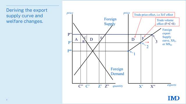
Like the import demand curve, we begin by considering how much Foreign would export at a given price. For example, how much would it export, if the price of its exports was P¢? At price P¢, Foreign firms would produce Z¢ and Foreign consumers would buy C¢. The excess production, equal to X¢ = Z¢ - C¢, would be offered for export. The fact that Foreign would like to export X¢ when the export price is P¢ is shown in the right panel at point 2.
If the price foreigner received for exports rose, Foreign would be willing to supply a higher level of exports for two reasons. The higher price would induce foreign firms to produce more and foreign consumers to buy less.
For example, the price P² would bring forth an export supply equal to X² (point 3 in the right panel). At price P*, exports are zero. Plotting all such combinations in the right panel produces the export supply curve XSF. We stress again the simple but critical point that the Foreign export supply is the Home import supply, thus we also label XSF as MSH.
The left panel also shows how price changes translate into Foreign welfare changes. If the export price rises from P¢ to P², consumers in the exporting country lose by A + B (these letters are not related to those in the previous figure), but the Foreign firms gain producer surplus equal to A + B + C + D + E. The net gain is therefore C + D + E. Using the export supply curve XSF, we can show the same net welfare change in the right panel as the area D plus F. Note that the insight from the MDH curve extends to the XSF curve, i.e. the XSF curve gives the marginal benefit to Foreign of exporting.
As with price changes in the MS curve, the welfare effects with the XS curve can intuitively be separated into the trade price effect and the trade volume effect. The price rise means Foreign gets a higher price for the goods it was already exporting (trade price effect, area D), and it gains from the extra exports elicited by the higher price (area F).
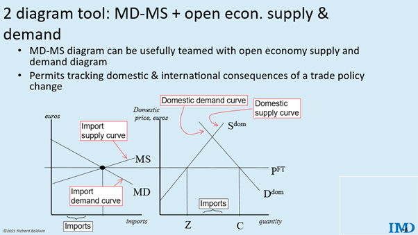
Step 3: The workhorse MD–XS diagram
Putting MD and XS together gives us the open-economy equilibrium (left diagram below). Home’s imports equal Foreign’s exports with both the Home and Foreign internal markets in equilibrium. The free-trade price is pinned down and the volume of trade is determined at the intersection. To reduce clutter, the ‘H’ and ‘F’ subscripts are omitted.
Assuming imports and domestic production are perfect substitutes (as mentioned above), the domestic price is set at the point where the demand and supply of imports meet, namely PFT (FT stands for free trade). While the import supply and demand diagram, or MD–MS diagram for short, is handy for determining the price and volume of imports, it does not permit us to see the impact of price changes on domestic consumers and firms separately.
This is where the right panel becomes useful. In particular, we know that the market clears only when the price is PFT, so we know that Home production equals Z and Home consumption equals C. The equilibrium level of imports may be read off of either panel. In the left panel, it is shown directly; in the right one, it is the difference between domestic consumption and production.
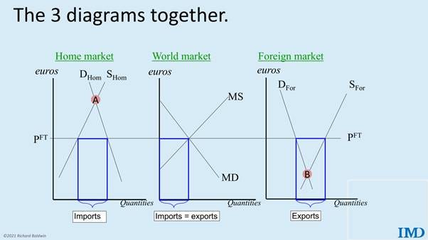
When things get exciting in trade policy, like in 2025, it is important to track the impact of a tariff on both the importing and exporting nations. The two-panel diagram only looks at the world and Home. Below we see the three diagrams together.
For the curious among you, note that the autarky price for this good in Foreign (B) is below that of Home (A), so Law of Comparative Advantage tells us that Foreign will be the exporter.
MFN tariff analysis
The principle of progressive complexity leads us to take a detour in our drive towards the analysis of Trumpian tariffs. To introduce the basic method of analysis, we first study the impact of a tariff on imports from Foreign. This is called MFN tariff analysis – where MFN means non-discriminatory but stands for “Most Favoured Nation” (MFN). It is non-discriminatory in the sense that the same tariff rate is charged on imports from every trade partner. This why we can aggregate all foreign nations into one, which we called Foreign in the diagrams above.
For historical reasons, a non-discriminatory tariff is called a ‘Most Favoured Nation’ (MFN) tariff (see EPRS 2025).
Price and quantity effects of a tariff
The first step is to determine how a tariff changes prices and quantities. To be concrete, suppose that the tariff which is imposed equals T euros per unit.
This type of tariff (set in euros or dollars rather than a percent of the price) is called a ‘specific tariff’. Most tariffs, and all of the new Trumpian tariffs are in percentage terms, also known as ad valorem tariffs. But it is much easier to do the diagrams with specific tariffs and there is little to zero insight gained from using ad valorum tariffs instead, so we’ll always use specific tariffs.
Before we get started there is one stumbling block you need to get past. When a tariff is imposed, there is not one price. There are two. 1) the price inside the importing nation; we call that the ‘domestic price’, say P, 2) the price the exporter receives which the P minus the tariff, P-T. We call this the ‘border price’ since it is the price of the good when it arrives at the border – before the tariff has been added on by the customs authority. So just keep that in mind. We’ll always use P and P-T to keep things straight.
Turning to the diagrams, the first step in finding the post-tariff price is to work out how the tariff changes the MD–MS diagram and here the charts below facilitate the analysis. The right panel shows the Foreign XS curve with the border price on the vertical axis, and the MS curve with the domestic price on the axis. When there was no tariff, those were the same MS=XS, but with a tariff, the exporters don’t see the same price and the importers, so the curves are no longer the same.
The bottom line is that the tariff shifts the MS curve up by T. Why? Because exporters would need a domestic price that is T higher to offer the same exports.
For example, how high would domestic price have to be in Home for Foreigners to offer to export Ma to Home? If the domestic price were Pa then exporters would receive Pa minus T, so the answer is Pa+T. so Foreigners would see a price of Pa. Doing that for every possible level of imports, we see that the MS has to be T higher than the XS.
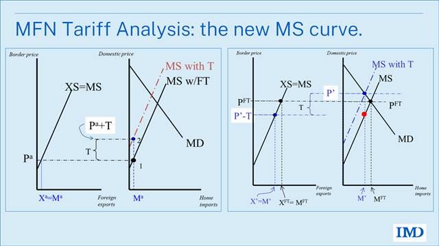
The right panel shows what the new post-tariff equilibrium looks like. New equilibrium in Home (MD=MS with T) is with P’ and M’. The domestic price now differs from border price (price exporters receive), namely P’ vs P’-T. Imports and exports are lower.
Note that the MD curve doesn’t shift since we derived it using the domestic price and we are still using the domestic price in the right-most diagram.
To sum up, an MFN tariff raises the domestic price, lowers the border price, and reduces trade. As drawn, it looks like the border price falls about as much as the domestic price rises but that’s only due to the slopes chosen for the MS and XS curves. You can play around with the slope to get different results. For instances if the XS curve is very flat, the border price will fall very little. This is called the tariff pass through issue.
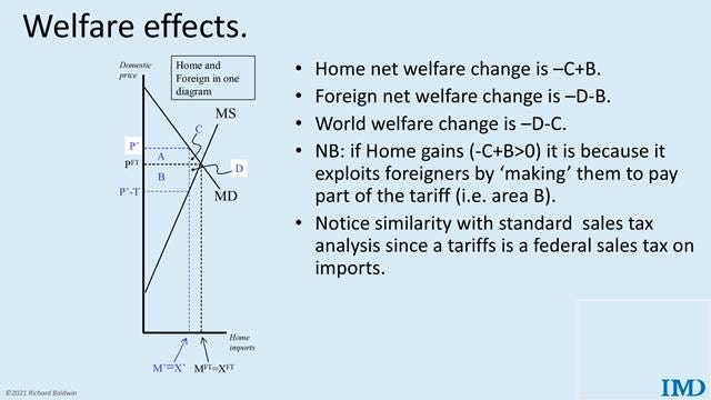
The welfare effects follow easily from the analysis we did with the MS and XS curves. These are show in the chart below.
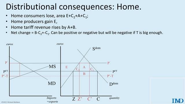
The distributional consequences in Home.
The illustration below shows and explains the impact of the tariff on groups inside the tariff-imposing nation, Home.
The higher domestic price hurts consumers, helps domestic producers, and raises some tariff revenue. Part of the tariff revenue is paid by Home consumers (area A) and part is paid by foreign exporters (B). The division of the burden of the tariff as a tax depends upon the slopes of the MS and MD as discussed above. The net change can be positive (if the C’s are less than B), or negative.
It’s hard to see but it is true that the gain will be positive if the tariff is sufficiently small (optimal tariff theorem), but negative if it’s sufficiently big. The reason is easy. As T rises imports fall and this reduces the tax base, but the size of the C triangles grow with the square of the tariff.
Basic economics of tariff discrimination.
As mentioned above, the second unusual thing about Trump II tariffs is that they are very different on different trade partners. India got hit with 50%. Switzerland got 39%. Australia got 10%.
This discrimination leads to some unintuitive economics effects, as we shall see. As a teaser, note that countries like Canada and Mexico may end up gaining from the Trumpian tariffs since their rivals in China, Europe, Japan and elsewhere pay even higher tariffs. To put it differently, you can win by losing less when tariffs are as discriminatory as the Trumpian tariffs. I made this point in my Factful Friday of 7 June 2025, “ Are Tariffs Reshaping Your Competitive Position in the US in Ways You Haven’t Considered?” And my 25 July 2025 Factful Friday, “Will Trump’s Tariffs Help Canadian and Mexican Industry?”
The standard tariffs diagrams cannot handle tariff discrimination since there is only one foreign source of imports. Here I introduce another set of diagrams to deal with this. The diagrams are a generalisation of the diagrams used to illustrate the impact of free trade agreements. Many textbooks have versions of these; my favourites are in Baldwin and Wyplosz (2004) and subsequent editions.
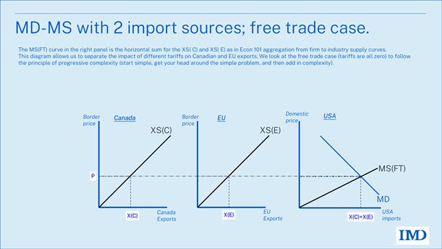
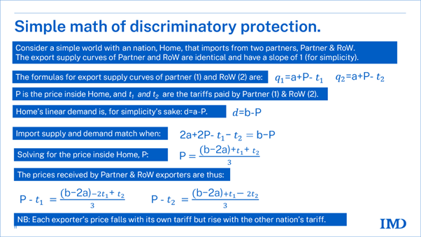
Simplifying to clarify, let’s suppose that there are only two sources of imports. Further simplicity is achieved by assuming that the goods of the two exporters are perfect substitutes and both perfect substitutes with USA production. The last simplifying assumption is that the two trade partners have identical XS.
Having worked through the diagrams above, we jump straight to the export supply and import demand curves in the exhibit below.
The MS(FT) curve in the right panel is the horizontal sum for the XS( C) and XS( E) as in Econ 101 aggregation from firm to industry supply curves. Here C stands for Canada, and E stands for EU. This allows us to study the imposition of different US tariffs on Canadian and EU exports.
To start with a simple base case, we look at the free trade case (tariffs are all zero). This is the principle of progressive complexity (start simple, get your head around the simple problem, and then add in complexity). But be sure to remember that you are making simplifying assumptions, so your results are not truths in themselves.
The price inside the US is P, and since there are no tariffs in the case at hand, the border price for both partners is also P. The exports and imports are as shown in an obvious notation.
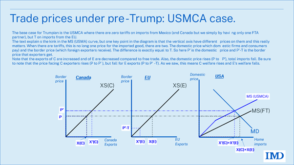
Now, starting from this situation, what do you think happens when the US raises a tariff on the EU? A moment’s reflection tells you that was approximately the situation before the Trumpian tariffs went up in 2025. The US and Canada were in a free trade agreement called USMCA (United States Mexico Canada Agreement since Mexico is part of it too in the non-simplified world), so the tariff on C was zero. But now EU exporters face a tariff T. The diagram below shows the outcome.
As usual, the first thing to due when analysing a tariff with such diagrams is to work out what happens to the MS curve.
One key point in the diagram is that the vertical axes have different prices on them and this really matters. When there are tariffs, there is not just one price for the imported good, there are two. The domestic price which domestic firms and consumers pay) and the border price (which foreign exporters receive). The difference is exactly equal to T. So here P’ is the domestic price and P’-T is the border price that exporters get. This was true in the MFN diagram but now we can consider different tariffs on the two partners.
Notice that there is a kink in the MS(USMCA) curve. The reason is that EU firms receive the domestic price minus the tariff, T, so until P>T, they supply zero exports. But after than, every domestic price increment brings forth exports from both C and E and so the MS curve resumes its usual slope (which is half that of each XS curve).
The key results of having a higher tariff on EU compared to Canada are: Exports of C increase while those of E decrease. compared to free trade. This is often called ‘trade diversion’ since some of the imports that used to come from EU are now coming from Canada. Also, the domestic price rises (P to P’), and total imports fall.
Now here comes the first unintuitive result: Canadian exporters, and Canada as a whole, gain because the US put a tariff on EU exports. Upon reflection, this is not unintuitive since T hobbled the EU rivals to Canadian exporters. Its like running a sprint and having the umpire force your rival to run with a heavy backpack. Your rival’s woe is your win.
How to see Canada’s win in the diagram? Remember for the leg work we did above, the welfare impact on the exporting nation varies only with the border price it receives. Here Canadian firms, which do not pay T, receive the domestic price P’, which is above what they got under free trade, P. Breaking it into trade price and trade volume effects, Canada wins since it gets higher prices for its exports and it exports more.
Just the reverse happens to EU exporters. They see their border price fall from P to P’-T, so they export less and get a lower price for what they do end up exporting.
In short, C welfare rises and E’s welfare falls.
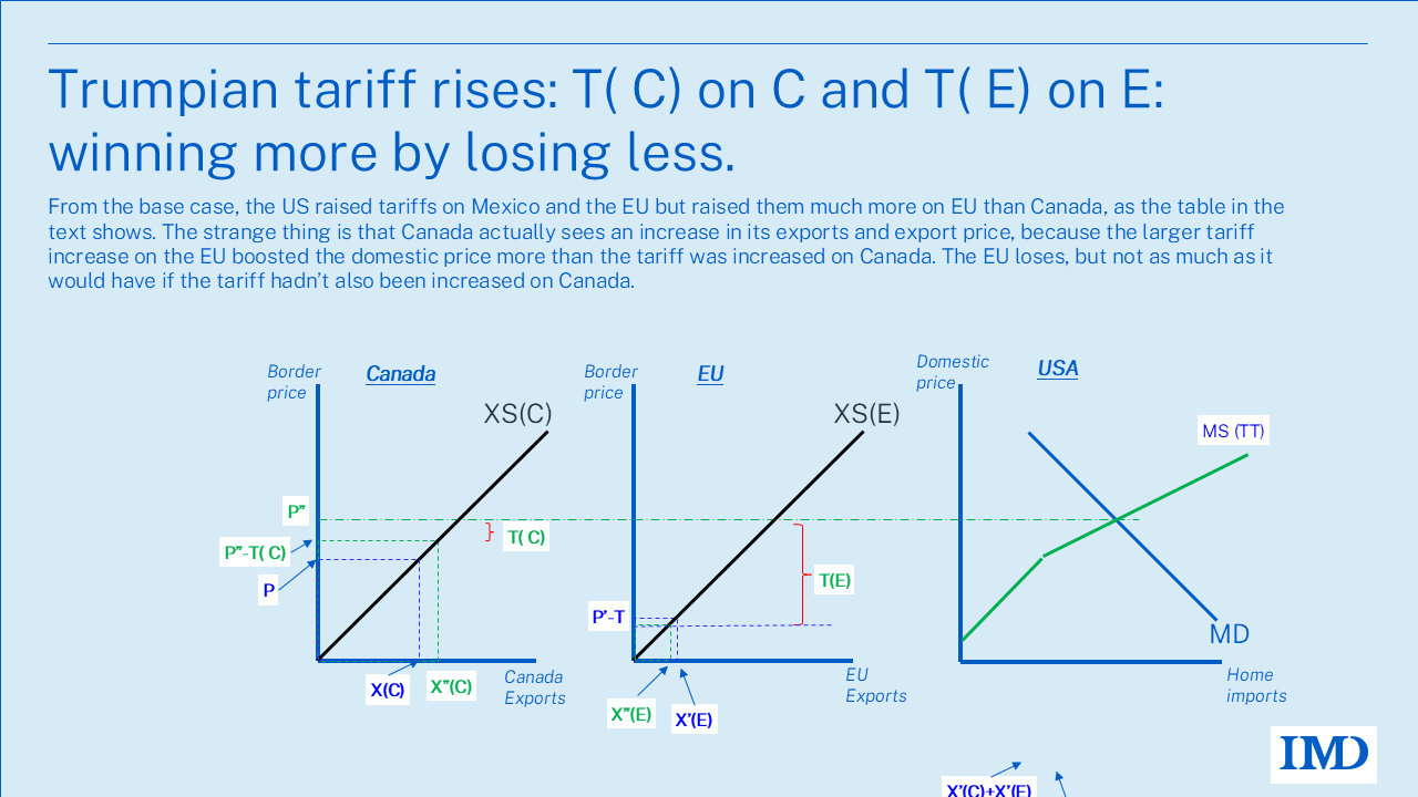
Impact of Trumpian tariffs: Higher tariffs on all but more on EU.
From the USMCA base case, consider what happens when the US raised tariffs on Canada (and Mexico) as well as on the EU, but raised them much more on EU than Canada and Mexico, as the table above showed.
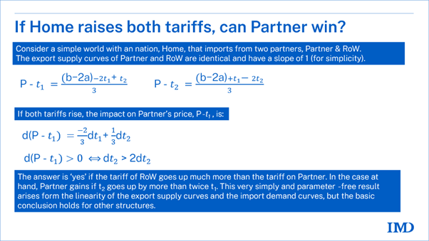
As we shall see, the strange thing is that Canada actually sees an increase in its exports and export price despite the higher tariff. Why? Because the larger tariff-increase on the EU boosted the domestic price more than the tariff hike on Canada. The big EU tariff raised US prices a lot, and the small tariff on Canada contributed to this, but the domestic price rise was less than the EU tariff but more than the Canadian tariff.
It is not sure this happens; it depends on magnitudes. The Annex show the maths that illustrates the sufficient condition for the result to hold. The broader point here is that discriminatory tariffs have different effects than the standard MFN tariffs.
The diagram below calculates the MS (TT), where TT stands for Trumpian Tariffs. There are no exports from C until the domestic price gets over T(C) and there are no exports from E until the domestic price rises above T(E).
The main results are the domestic price rises to P” while the border price for EU falls to P”-T( E). The border price for Canadian exporters rises to P”-T(C). Naturally, C’s exports rise, E’s exports fall and overall US imports fall.
The welfare analysis for the US in this case is complicated by the fact that it charges different tariffs on C and E. Moreover, the imports from the partner it raised the tariff most on fall, but the imports from the low-tariff rise country rises. Experienced readers will see that this is very similar to the preferential tariff analysis that Jacob Viner pioneered in the 1950s when the UK was considering joining the EU (then called the European Economic Community). I’ll leave that as an exercise.
Different tariffs on inputs and final goods.
Second thing that’s truly unusual about the Trumpian tariffs is that tariffs applied to different goods are at very different heights. This is not the usual practice where generally speaking tariffs are fairly uniform. Of course, almost every country has some favoured section that gets very high tariffs but by and large in advanced economies, for example, most of the tariffs on all types of goods were around 2 to 5%. In emerging economies, applied MFN tariffs tend to be fairly uniform and around 9%.
One of the most striking things about the Trumpian tariffs is that tariffs on imports that are needed for manufacturing inside the United States have been raised much higher than the tariffs on the final goods. Even a moment’s reflection makes it clear that raising tariffs very high on the imports – specifically much higher than on the outputs – actually makes it less attractive to produce the output inside the United States. This is much less of a concern when for example the tariff on all the inputs is say 5% and all the outputs is say 5% you don’t get the distortion.
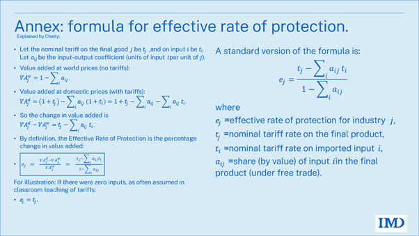
Effective Rate of Protection theory (ERP).
The technical name for this mechanism is Effective Rate of Protection theory, or ERP for short. It was developed in the 1960s when developing countries, as we call them back then, we’re trying to industrialize and using tariffs to do it. There is a standard formula for it that I relegate to the annex.
To illustrate the economics behind this, we need a new diagram.
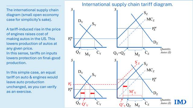
The international supply chain diagram.
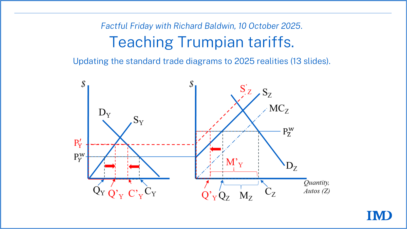
The diagram we need will clearly require considering inputs and outputs simultaneous. The exhibit below shows the pair of diagrams that illustrate the linkage between the US input and US output markets when both are traded. To simplify the analysis, we assume both markets are perfectly competitive (as in all the diagrams above). More substantively, we assume, for simplicity, that one final good requires one part as an input. You can think of this, for example, as one engine per car. Parts are called Y; final are called Z (Y comes before Z as parts come before final goods).
The open economy diagram for the parts market is in the left panel. It shows the domestic parts supply curve (SY), and it shows the demand curve (DY), which is the “derived demand” from the final goods sector. You can verify, as an exercise, that the slope of the derived demand for parts in the left panel has the same slope, but opposite sign, as the domestic supply curve in the right panel – given the one engine per car assumption.
In this case, we take the import price as , and this, as usual, determines the price of parts inside the US. Thus, US output, imports, and consumption are QY, MY, and CY.
The right panel shows the open economy diagram for final goods. The linkage between the two diagrams comes from the fact that we assume that the marginal cost of turning one part into one final good is described by the marginal cost curve labelled MCZ. This curve reflects the costs of things like labour, capital, land, energy etc which are needed to make an auto from an engine. The most important point to note is that the marginal cost for producing autos – including the price of the engine – starts at the price of engines. That’s why the supply curve of autos starts at the point on the Y axis that represents the cost of engines. Just to be clear. Every subsequent auto produced will require one engine plus the relevant marginal cost. Thus, the supply curve for final autos is rising (SZ).
The auto import price, in this example, is , and this, as usual, it determines the price of autos inside the US. Namely, US output, imports, and consumption are QZ, MZ, and CZ.
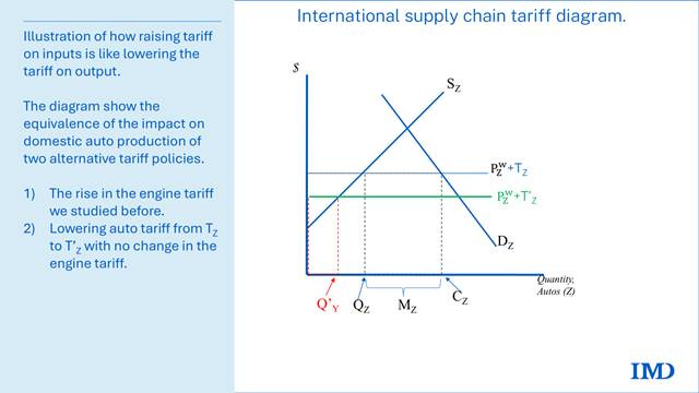
The key usefulness of this linked pair of diagrams is that there’s now an explicit connection between the price of inputs and the supply curve for final autos. This allows us to demonstrate clearly how raising protection on the inputs lowers protection on the output.
What happens when the country imposes a tariff on inputs?
We use the linked diagrams to study the impact of an increase in the tariff on engines with no increase in the tariff on autos. This roughly represents the current situation where the tariff on inputs was raised much more than the tariffs on final goods.
When a tariff is imposed on the import of engines in the left diagram, the result will be a rise in the price of engines from the world price. The new price inside the US rises to P’Y. The tariff is not shown explicitly in the left panel in order to reduce clutter. But here we are assuming, for simplicity, the small open economy case, so the tariff is simply the difference between the new price and the world-price.
The impact of the tariffs on the engine market is the usual one we studied in the MFN analysis above. Domestic production of engines increases from QY to Q’Y, the consumption of engines falls from CY to C’Y.
The higher engine price is a negative supply shock in the auto market in that it raises the supply curve in the right panel. With inputs now more expensive in the US, the cost of auto production rises. This is shown as the rise of the supply curve from SZ to S’Z,.
By assumption, we assume no change in the price of autos since the import price, in this simple small-open-economy case, is unchanged as the tariff on autos is unchanged.
The result is no change in auto consumption, but a drop in US auto production that is exactly offset by a rise in imports. Specifically, production falls from QZ to Q’Z, and imports rise from MZ to M’Z.
It is in this sense that a rise in the tariff on inputs is like a reduction of the tariff on outputs. The diagram below makes this idea more explicit. It looks at the impact on the auto sector assuming there’s no change in the tariff on engines, so there’s no shift in the domestic supply curve of autos. The change here is that the tariff on autos has been reduced. It is in this sense that raising input tariffs is like lowering output tariffs when it comes to domestic production of autos (which is the aim of tariff protection).
Obviously the two tariff policies are not equivalent in terms of other things like the price that domestic consumers face for autos and the number of autos purchased but in terms of the key goal of Trumpian protection they are equivalent.
Teaching the difference between narrow and broad tariffs.
The third difference between normal tariff policy and Trumpian tariffs concerns their breadth. Trumpian tariffs are both high and broad in a way Americans haven’t seen since steam engines pulled the trains, and trains were the equivalent of today’s planes in terms of travel importance. In other words, a very long time ago, like 1929.
The Trumpian tariffs are basically trying to protect every industrial sector in America at the same time. In this sense, they are nothing like the tariffs from the first Trump administration.
In this case, the partial equilibrium assumption underlying conventional diagrams is misleading. These diagrams are valuable when analysing the effects of policies such as tariffs on washing machines, as the washing machine sector is sufficiently small that broader general equilibrium impacts, such as changes in factory worker wages or the cost of other resources, can reasonably be disregarded.
I ran out of time to write up the slides in the text, but the slides below explain the basic points.
Summary and closing remarks.
The diagrams above remind us that tariffs work through higher prices, namely who pays them, who pockets them, and how they reshape production incentives at home and abroad.
I started with the standard MFN case. This isn’t directly relevant to Trumpian tariffs but does provide an easy entry point for the analysis. The lesson is that a tariff drives a wedge between domestic and foreign prices. Home prices rise, imports shrink, and income gets redistributed between consumers, producers, and the government. In particular, losers lose more than winners win, where the losers are consumers and foreign exporters, and the winners are domestic producers and the treasury gain.
At face value, this is hardly what you’d call a pro-middle-class policy since only about 10% of the US workforce has jobs in goods-producing sectors and tariffs can only protect such jobs. The other 90% just see higher prices (Baldwin 2025, “Are We Seeing Peak Trumpian Tariffs? Economic pain for the middle class and looming midterms undermine Trump’s tariff leverage abroad”). How tariffs came to be the cure-all for middle class malaise is beyond me, but that is how the President is selling them to his political base.
I needed to go beyond the standard diagram because Trumpian tariffs break the tidy logic of textbook diagrams. They are high, uneven, and broad.
Different rates across partners (45 % for China, 10 % for Saudi Arabia) and across products (50 % on metals, 25 % on cars, zero on energy) make it impossible to treat “Foreign” as a single country or “imports” as a single good. When inputs face steeper tariffs than final goods, effective protection collapses. Factories that were supposed to be shielded instead find themselves uncompetitive.
And because tariffs now cover nearly every industrial sector, their effects spill across markets. The American economy is near full employment and there are currently 400,000 unfilled jobs in US manufacturing. The way tariffs work is by increasing the demand for US-made goods and thus pushing up US industry’s demand for US manufacturing workers. But if there is already a shortage of such workers, the likely impact will be a bidding up of wages as well as other input prices. There is a lot to like about the idea of US factory workers getting higher wages, but there is unlikely to be a great deal of job creation. As the Bedouin seller of ice cream cones in the middle of the Sahara Desert found out, it’s about supply and demand, not just demand.
I also presented a framework for thinking about the impact of the way Trumpian tariffs are increasing the cost of manufacturing in the US. This is really unusual, but not noted frequently enough -- probably because this sort of practice fell out of favour in policy circles many decades ago.
Most governments long ago learned the logic of the effective rate of protection (ERP): raising tariffs on imported inputs undercuts the down-steam industries. Indeed, from the 1960s to the 1980s, many developing nations did use the ERP logic to attract assembly and jobs to down-stream sectors.
Classic Import Substitution Industrialisation (ISI) strategies in autos illustrate this well. Malaysia’s low tariff on auto parts but 80 % on finished cars created a domestic “car industry” based on imported Complete Knock-Down (CKD) kits. (See my “Trade and Industrialisation After Globalisation’s 2nd Unbundling” for the comparative story.)
The Trump administration’s approach has flipped that logic. Input tariffs are sky-high – around 45 % on Chinese parts and 50 % on metals – while tariffs on finished autos are lower, typically 25%, with many exemptions for Canada, Mexico, Europe, Korea, and Japan.
In effect, this is upside-down ISI. It is protection aimed at producers that ends up discouraging production at home. By taxing the parts and materials that American manufacturers need, these tariffs erode the competitiveness of U.S. assembly plants and shift advantage to foreign carmakers. It’s an unintended gift to producers in Mexico and Canada as I argue in my July VoxEU piece (Will Trump’s tariffs help Canadian and Mexican industry?).
The broader lesson is that Trumpian tariffs were either designed without input from economists who could have predicted the wayward outcomes we have seen, or they were designed with something other than economic goals in mind. Frequent readers will know that I believe that latter (which also explains why the former is also true). I call it the “Grievance Doctrine” in my May 2025 eBook on Trumpian trade policy.
While grievance tells us why President Trump is doing this, we still need trade theory to explain the economically incoherent impact of his emotionally coherent tariffs.
And that’s it for another Factful Friday!
References.
Baldwin, Richard. 2025. “Why Haven’t Trumpian Tariffs Done More Damage?” Factful Friday column, LinkedIn, September 5, 2025.
Baldwin, R., & Wyplosz, C. (2004). The Economics of European Integration (1st ed.). McGraw-Hill Education.
Baldwin, R. (2025, September 13). Are we seeing peak Trumpian tariffs? (Factful Friday). Retrieved from https://rbaldwin.substack.com/archive
Corden, W. M. (1962). The structure of a tariff system and the effective protective rate. Journal of Political Economy, 70(1), 80–91. https://doi.org/10.1086/258611
European Parliamentary Research Service (EPRS). (2025, January). Understanding import tariffs under WTO law (At a glance No. 769543). European Parliament. https://www.europarl.europa.eu/RegData/etudes/ATAG/2025/769543/EPRS_ATA(2025)769543_EN.pdf
Annex: Effective rate of protection more generally.
Annex: Math of discriminatory tariffs – a simple case.
And then:
Thank you Richard! easy to understand
Thank you Richard!