
How the G7 deindustrialised.
Seven charts showing how dominance was lost.

Richard Baldwin, 2 January 2026, Factful Friday.
Introduction.
Perhaps the greatest event in modern economic history was the industrialisation of the G7 nations and their rise to dominance of the world economy.
During the 19th and 20th centuries, the G7 economies industrialised faster and grew faster than the world average. This pushed them to the point where they generated about two-thirds of world manufacturing and GDP while accounting for only 13% of the world’s population.
That left a third of the world’s income to be split among the other 4.5 billion people on the planet.
This event has been called The Great Divergence (Pomeranz, 2000). G7 per-capita incomes soared far above the world average. It created the world we all know today. One where a few countries are fabulously rich, but most are not.
Perhaps the second greatest event in modern economic history was the deindustrialisation of the G7 relative to the rest of the world, and its loss of economic dominance.
From about 1990, the nature of globalisation changed. Goods had been moving across borders for millennia, but now manufacturing knowhow was also moving from G7 nations to a handful of emerging economies (Baldwin, 2016).
This being Factful Friday, I’m sure you want to see the facts on what happened before hearing the theories on why it happened.
The Facts.
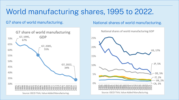
Using the OECD’s TiVA dataset, the left panel of the chart below shows how the G7 as a whole went from accounting for 67% of world manufacturing in 1995 to 34% in 2022. That drop, in my view, explains a lot of the geopolitical tension in today’s world. It brings to mind the Thucydides Trap (Allison, 2017).
The right panel shows that national world manufacturing shares, all of which plummeted, but not equally. Japan’s fall is spectacular; from 23% to 5%. The US’s share dropped but stabilised at about 17% from the 2010s. Germany, the third of the Big-3, dropped from 9% to 5%. The other G7 were all below 5% in 1995 and ended 2022 with about half their 1995 share.
But falling shares raise a key question: was this deindustrialisation, or just overall downsizing relative to fast-growing emerging economies?
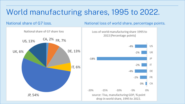
The next pair of charts shows the same information from two different perspectives. The left chart shows how the G7’s total decline from 67% to 34% was dealt out among the individual G7 nations. Japan accounted for over half, the US and Germany for about 1/8th each, and UK, France, and Italy for 1/17th each, and Canada for only 2%.
If you’re in a hurry, just remember that Japan is in a league of its own in terms of relative deindustrialisation, and the Big-3 together (US, Japan, and Germany), accounted for 80% of the G7’s loss.
The right panel show the world share percentage point drops by nation. Canada lost the least in terms of share moving from 1.8 in 1995 to 1.3 in 2022.
So far, the facts tell us three things.
· First, the G7’s loss of global manufacturing share was large, long-lasting, and widespread across countries.
· Second, this was not just arithmetic. In most G7 economies, manufacturing shrank relative to the rest of the economy. It was deindustrialisation, not simply slower growth than the rest of the world.
· Third, the experience was uneven. Some countries saw gradual erosion, others sharp breaks, and the timing differed markedly across the G7.
The remaining question is simple.
Was it deindustrialisation or loss of relative size?
The G7’s loss of world manufacturing shares is remarkable. But there is a real question as to what drove it. A shrinking world share does not always mean a shrinking national sector.
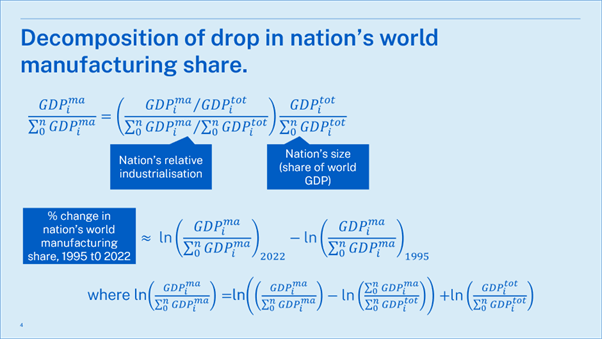
Logically, a nation’s loss of world manufacturing share can come from two sources.
· At one extreme, the role of industry in the nation’s economy could be unchanged, but its relevant size in the global economy could have fallen.
· At the other extreme, the nation’s share of the world economy could have stayed steady, but the role of manufacturing in its domestic economy could have shrunk.
There is a slide in the annex that shows the maths for those who care.
National deindustrialisation and size trends.
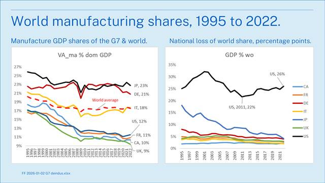
The charts below show the facts for the G7. The left panel shows how the role of manufacturing changed in the G7 economies from 1995 to 2022 (the data available in the TiVA database).
Note that at the global level, manufacturing GDP’s share was pretty steady, but dropped from 20% in 1995 to 18% in 2022. This tells us that global deindustrialisation is not part of the G7 storyline.
Broadly speaking, there are two types of G7 experiences shown in the left chart. Japan, Germany, and Italy started out with manufacturing shares above the world average, saw decline, but ended up at or above the world average. Japan and Italy’s shares stabilised since 2010, or so. Germany’s stabilised but resumed its decline from the late 2010s.
The others, the US, France, Canada, and the UK, started low and fell rapidly, especially up to 2009. This is what I would call relative deindustrialisation. It meant that their manufacturing grew slower than the world average since 1995. The deindustrialisation (in the sense of GDP shares) has slowed or reversed in the 2020s for the US, France, and Canada.
Britain stands out in that it experienced an acceleration of its deindustrialisation in the 2020s. It may not be a coincidence that this happened when the country implemented its exit from the EU’s manufacturing network (the Single Market). The EU-UK Trade and Cooperation Agreement (TCA) was signed in December 2020 and implemented immediately (EU, 2021).
The right chart shows the facts behind what might be called the scale effect. Most of the G7 nations saw their importance in the world economy fall steadily during these decades. The US stands out in that its share rose during the 1990s, fell in the 2000s, and recovered since. Its average share of the world economy thus fluctuated around 25% throughout but seems to be on an upward trend. This, as diligent readers would have realised, meant that the US was growing faster than the world economy since 2011. The other stand-out performer was Japan, but in the opposite direction. Its world GDP share declined from 18% to 4%.
The decomposition.
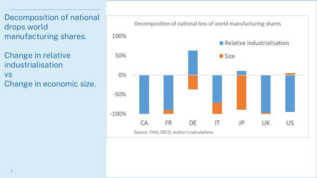
As mentioned, we can break down each nation’s loss of world manufacturing share into a relative deindustrialisation factor, and a size factor. The chart shows the break down.
As expected, relative deindustrialisation was the main factor for most of the G7 economies. For Canada, France, the UK, and the US, this factor was dominant. But for Germany and Japan, it worked in the opposite direction since the importance of manufacturing in their GDPs rose relative to the world average. That is why their blue bars are above the zero line.
The size factor was super important for Japan in the sense that its loss of world shares was due entirely to its loss of relative size. Size was also important for Germany and Italy.
It is interesting to see that the US and Japanese experiences were at the opposite extremes. The US loss of manufacturing share was due to its relative deindustrialisation (Canada follows the same pattern). Japan’s was due to its loss of relative size.
Summary and Closing Remarks.
What caused the flip from the first greatest event in modern economic history (G7 industrialisation) to the second greatest (G7 deindustrialisation)?
In my view, the flip was driven by a change in the nature of globalisation. From the late 20th century onwards, the ICT revolution made it feasible to organise massively complex activities, like modern manufacturing, at great distance (Baldwin, 2016).
Once this became feasible, vast international wage differences made it profitable. G7 firms offshored their management, technical, and engineering knowhow to combine it with low-wage labour abroad. A new combination emerged: high-tech-low-wage manufacturing. Before ICT, the choices were high-tech-high-wage production in advanced economies or low-tech-low-wage production in emerging economies. This combination was highly competitive and highly profitable.
It also marked a de-nationalisation of comparative advantage on a global scale. The G7’s source of comparative advantage (technology) was being combined with the emerging economies’ source of comparative advantage (low wages) in offshored factories.
This flow of know-how from G7 firms to emerging economies, and the new, mix-and-match competitiveness it created, had an unintended side effect.
It triggered industrialisation in the receiving nations at a pace that was entirely without historical precedent. This was industrialisation driven by a process that had very little in common with the 19th-century industrialisation of the G7.
The name I gave to this history-shifting switch was globalisation’s ‘second unbundling’ (Baldwin 2006). ICT allowed G7 manufacturing processes to be sliced into stages and moved abroad. Factories shifted from being geographically bundled to geographically unbundled.[i] It later came to be called ‘hyperglobalisation’ in reference to the way deep economic integration conflicted with national sovereignty and democracy (Rodrik, 2011).
And that’s it for another Factful Friday!
References.
Allison, G. (2017). Destined for war: Can America and China escape Thucydides’s trap? Houghton Mifflin Harcourt.
Baldwin, R. E. (2006). Globalisation: the great unbundling(s). Prime Minister’s Office, Economic Council of Finland.
Baldwin, R (2016), The Great Convergence: Information technology and the new globalisation, Harvard University Press (Chapter 3).
Baldwin, R (2019), The Globotics Upheaval: Globalization, robotics, and the future of work, Oxford University Press.
Baldwin, R (2023). Where in the world are manufacturing jobs going? Factful Friday, 22 December 2023, Linkedin, https://www.linkedin.com/pulse/where-world-manufacturing-jobs-going-richard-baldwin-x1zbe/
Baldwin, R (2024). “China is the world’s sole manufacturing superpower: A line sketch of the rise”. VoxEU.org, 17 January 2024. https://cepr.org/voxeu/columns/china-worlds-sole-manufacturing-superpower-line-sketch-rise
Baldwin, R (2024). India vs China: Trade’s role in their industrialisation, Factful Friday, Linkedin, March 15, 2024.
European Commission. (2021). EU–UK Trade and Cooperation Agreement.
Herrendorf, B., Rogerson, R., & Valentinyi, Á. (2014). Growth and Structural Transformation. In Handbook of Economic Growth (Vol. 2, pp. 855–941).
Pomeranz, K. (2000). The great divergence: China, Europe, and the making of the modern world economy. Princeton University Press.
Rodrik, D. (2011). The globalization paradox: Democracy and the future of the world economy. W. W. Norton & Company.
Annex.
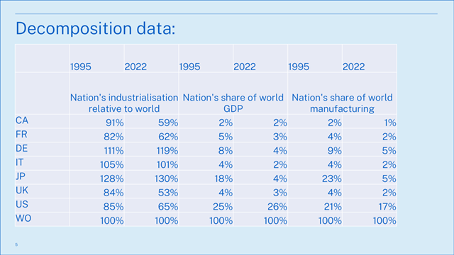
Here for those of you inclined to track down more details, here are the figures I’m using in the decomposition. All are based on the online TiVA database.
[i] For completeness, note that the ‘first unbundling’ was when consumption and production separated geographically, giving rise to the Great Divergence.
Interesting analysis. Could the change in Japan's size be related to (or mostly caused by) the change in the value of the yen, from about 80 per $ in 1995 to about 130 per $ in 2022? This change in value was mostly the result of capital flows as interest rates in Japan declined relative to those in the U.S. and other developed countries...